Have you ever wondered why certain colors make you feel calm while others energize you? Or why some brands choose vibrant hues while others stick to muted tones?
The secret lies in color psychology—a fascinating field that explores how colors influence our emotions, perceptions, and even decisions. Understanding color psychology can be a game-changer for anyone involved in design, whether you’re revamping your living space, creating a brand identity, or crafting an eye-catching website.
By mastering the art of color selection, you can communicate your message more effectively and create powerful connections with your audience. So, why not dive in and discover how the colors you choose can transform your designs and leave a lasting impression?
Color Basics
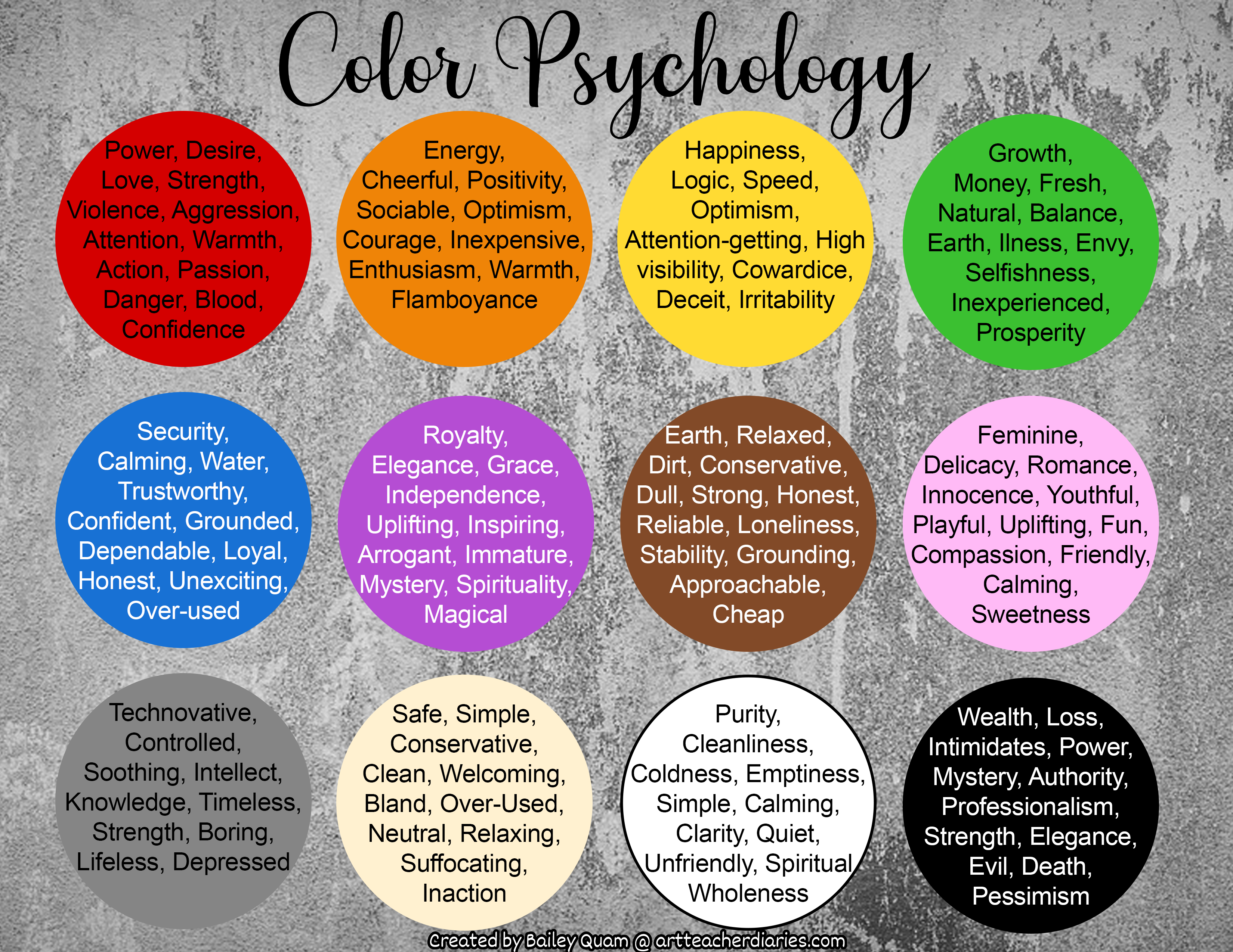
Colors make us feel different things. Red is often linked to passion or anger. Blue can feel calm or sad. Green is the color of nature and can feel fresh. Each color has a unique effect on our mind.
Designers use colors to create moods. Bright colors can make us feel happy or excited. Dark colors may feel serious or mysterious. Mixing colors changes how we feel. Good design uses the right colors for the right feeling.
Colors can also show contrast. White and black make strong contrasts. This helps show what is important. Designers use contrast to grab attention. Every color has a story to tell. Learning about colors helps in making better designs.
Psychological Effects
Colors can change our feelings. Red makes us feel strong. It can make us feel excited or even angry. Blue helps us feel calm. It feels like the sky or sea. Green reminds us of nature. It makes us feel healthy. Yellow brings happiness. It looks like the sun.
Some colors help us think better. Black is serious and smart. White feels clean and fresh. Bright colors help us pay attention. Dark colors make us feel relaxed. Designers use these colors to send messages. They want people to feel certain ways. Choosing the right color is important.
Design Applications
Colors can change how people feel. Designers use this to make things better. Bright colors can make people feel happy and excited. Soft colors can calm people down. Red is often used to grab attention. Blue is common in designs to show trust. Different colors can mean different things. This is important in design.
Designers pick colors to send a message. Warm colors like red and orange can feel cozy. Cool colors like blue and green can feel refreshing. Using the right colors helps people understand things faster. It also makes things look nice. Colors in design are more than just pretty. They have a job to do.


Conclusion
Color psychology plays a crucial role in design. Colors can influence emotions and decisions. Designers use colors to evoke specific feelings. A warm palette can feel inviting and cozy. Cool tones might offer a sense of calm. Understanding these effects helps create effective designs.
It’s not just about aesthetics; it’s about connection. Choosing the right colors can improve user experience. It can also enhance brand recognition. Remember, each color tells a story. Use them wisely in your designs. Explore, experiment, and see what works best.
Your design’s success might just depend on it.