Have you ever wondered why certain colors make you feel a certain way or why some color combinations just seem right? Understanding the basics of color theory can transform how you perceive and use colors in your daily life.
Whether you’re decorating your home, choosing an outfit, or designing a website, color theory can guide your choices to create harmony and evoke emotions. Imagine being able to effortlessly create spaces that feel inviting, select colors that boost your mood, or design visuals that captivate attention.
You’ll discover the essentials of color theory that will empower your creative decisions and unlock a new level of understanding and confidence in using colors effectively. Prepare to see the world in a vibrant new light, where every shade and hue can play a role in your personal and professional expression.

Credit: www.qdigitizing.com
Basics Of Color Theory
Understanding the basics of color theory is like finding the key to a vibrant world. It’s the art and science of using colors to evoke emotions, communicate ideas, and transform spaces. Whether you’re a budding artist or a home decorator, grasping these essentials can make your creations more compelling. Let’s dive into the fundamental elements of color theory.
Primary Colors
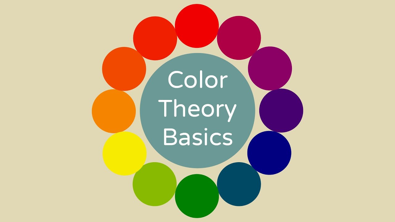
Primary colors are the root of all other colors. They include red, blue, and yellow. These are pure colors that can’t be made by mixing other colors. Think of them as the foundation of your color palette. Next time you’re painting or choosing a color scheme, start with these bold, basic colors. They set the tone for everything else.
Secondary Colors
Secondary colors are created by mixing primary colors. Combine blue and yellow to get green. Mix red and blue to create purple. Blend red and yellow to form orange. Consider how these combinations can add depth and interest. These colors often bring harmony and balance to your design, making it more appealing.
Tertiary Colors
Tertiary colors emerge when you mix a primary color with a secondary color. You get hues like red-orange or blue-green. These colors are more subtle and offer a wide range of shades. When you’re looking for complexity and nuance in your work, these colors can be your best friend. How might you use these hues to create a unique mood?
Color theory is not just a tool for artists; it’s a powerful ally in everyday life. Whether you’re choosing an outfit, designing a room, or planning an event, understanding how colors interact can significantly impact the outcome. Start experimenting with these basics, and watch your creativity flourish.

Credit: shop.decoart.com
Color Wheel Dynamics
Understanding color wheel dynamics is like holding the key to a vibrant visual world. It’s not just about picking colors that look pretty together; it’s about crafting harmony and contrast that captivate your audience. Whether you’re designing a logo, painting a room, or creating digital art, grasping the essentials of the color wheel can transform your work from ordinary to extraordinary.
Complementary Colors
Complementary colors sit opposite each other on the color wheel. This opposition creates a visual tension that can be quite striking. Think of red and green or blue and orange. These combinations can make your design pop, offering a bold and dynamic look. Next time you’re designing, try pairing complementary colors for a look that demands attention.
Analogous Colors
Analogous colors are neighbors on the color wheel. These colors blend naturally and create a soothing effect. Imagine a serene landscape painted with blues, teals, and greens. This scheme is perfect for designs that need to convey calmness and harmony. How can you use analogous colors to create a peaceful ambiance in your living space?
Triadic Color Schemes
Triadic color schemes involve three colors evenly spaced on the color wheel. This setup offers a vibrant yet balanced palette. Imagine using red, yellow, and blue together in a design. Each color complements the others, creating a lively and harmonious look. Experiment with triadic schemes to add a playful and energetic vibe to your projects.
As you explore these color dynamics, consider how they can change the mood and message of your work. What feelings do you want to evoke? Which colors speak to your style? The answers will guide you toward creating visually stunning and emotionally impactful designs.
Psychology Of Colors
Colors are not just visual stimuli; they are powerful tools that can influence emotions and perceptions. Whether you’re choosing a color scheme for your living room or designing a logo for your brand, understanding the psychology of colors can be a game-changer. How do colors affect your mood and decisions? Let’s dive into the fascinating world of color psychology, exploring its emotional impact, cultural significance, and associations.
Emotional Impact
Colors can stir emotions and set moods. Imagine walking into a room painted in bright yellow; it might boost your energy and make you feel cheerful. On the other hand, a dark blue room might calm you down and create a sense of peace.
Brands use color to evoke specific feelings. Think about the red used by fast-food chains—it’s not just about standing out. Red is known to increase appetite and excitement. Next time you feel a craving, notice the colors around you.
Consider your personal experiences with colors. Have you ever felt relaxed in a green setting? Green is often associated with nature and tranquility. If you’re looking to enhance your mood, try changing the colors in your environment.
Cultural Significance
Colors hold different meanings across cultures. In Western cultures, white is often associated with purity and weddings. However, in some Eastern cultures, white can symbolize mourning and funerals.
Color meanings can influence global marketing strategies. Think about how a brand might choose different colors for its products in various countries. Understanding these cultural nuances can make or break a marketing campaign.
Ask yourself how colors have shaped your perceptions. Have you ever felt out of place because of a color choice? Consider researching the cultural implications of colors before making significant decisions.
Color Associations
Colors often come with associations that can shape our perceptions. Take blue, for instance. It is frequently linked to trust and reliability, which is why many tech companies use it in their branding.
Colors can also affect how you perceive temperature. Red can make a room feel warmer, while blue might make it feel cooler. This is useful when choosing colors for your home or office.
Think about how you use colors in your daily life. Are you choosing colors that align with their associations? Consider using colors strategically to enhance your environment and personal brand.
As you explore the psychology of colors, remember that it’s not just about aesthetics—it’s about creating an experience. What colors will you choose to shape your world?
Color Harmony Techniques
Exploring color harmony techniques enhances design by balancing hues. Primary, secondary, and complementary colors create visual appeal. Understanding these basics helps in crafting aesthetically pleasing combinations that captivate.
Color harmony is the magic that makes a design visually appealing. It’s the secret sauce that can transform an ordinary composition into something truly striking. By understanding different color harmony techniques, you can create designs that not only look good but also evoke the right emotions. Let’s break down some key techniques you can use to master this art.Monochromatic Schemes
Monochromatic schemes are all about simplicity. They use variations of a single color to create depth and interest. Think of different shades, tints, and tones of blue in a room—a light sky blue for the walls, a navy blue couch, and accents in teal. This approach is perfect for creating a clean and cohesive look. It’s also easy on the eyes, making it ideal for professional settings. Have you ever noticed how calming a spa feels with its seamless, soothing color scheme? That’s monochromatic magic at work.Split Complementary Schemes
If you’re looking for contrast without the clash, split complementary schemes might be your answer. This technique involves one base color and two adjacent tertiary colors from the color wheel. Imagine a vibrant orange paired with blue-green and blue-purple hues. This method offers the contrast you need to make elements stand out without overwhelming the viewer. It’s a great choice for those who want a balance between vibrancy and subtlety. Picture a sunset with its mix of warm and cool tones—inviting, isn’t it?Tetradic Schemes
Tetradic schemes take things up a notch with four colors arranged in two complementary pairs. This creates a rich, diverse palette that can be both dynamic and harmonious. Consider a garden bursting with the colors of red roses, green leaves, orange marigolds, and blue hydrangeas. The challenge here is maintaining balance. Too much of one color can throw the harmony off. Have you ever tried to decorate a room and found yourself overwhelmed by too many colors? Tetradic schemes demand careful attention to proportion and placement. When you understand these techniques, you gain control over how your audience feels and reacts to your work. Which harmony technique aligns with your style? Experiment and see how different schemes can transform your designs into something memorable.Using Colors In Design
Using colors in design can greatly influence how a project is perceived. Colors have the power to evoke emotions, enhance aesthetics, and communicate messages. Understanding color theory is essential for designers looking to create impactful work. This section will explore the key aspects of using colors effectively in design.
Balance And Contrast
Balance in design ensures all elements are evenly distributed. It creates harmony and a pleasant visual experience. Contrast highlights differences between colors, making key elements stand out. Effective use of balance and contrast guides the viewer’s attention to important areas. This can enhance the overall user experience.
Creating Mood
Colors can set the mood and tone of a design. Bright colors often convey energy and excitement. Soft, muted colors can create a calm and serene atmosphere. Designers use color combinations to evoke specific feelings. This helps in aligning the design with the intended message or theme.
Brand Identity
Colors play a crucial role in establishing brand identity. Each color can represent different aspects of a brand’s personality. Consistent color use helps in building brand recognition. It creates a visual connection with the audience. Choosing the right colors can differentiate a brand from competitors. This strengthens its identity in the market.
Credit: www.youtube.com
Digital Color Tools
Understanding color theory is essential for anyone working in design, art, or even marketing. But with the rise of technology, traditional methods are complemented by digital tools that can enhance your color selection and application. These digital color tools are game-changers in the creative world, offering precision and versatility. Whether you’re designing a website, crafting digital art, or choosing brand colors, these tools can make your job easier and more effective.
Software Applications
Software applications are indispensable in the realm of digital color tools. Programs like Adobe Photoshop and Illustrator offer extensive color palettes and customizable options. You can experiment with different shades and gradients, adjusting them to suit your project perfectly. Have you ever struggled to find the right hue for a project? These applications let you test colors without committing, saving you time and frustration.
Another powerful software is CorelDRAW, which offers intuitive color tools for vector graphics. It’s ideal if you’re designing logos or detailed illustrations. CorelDRAW helps you see how different colors interact, enabling you to make informed decisions. Have you thought about how a slight color change can affect your design’s mood? Testing it in these applications can reveal surprising insights.
Online Resources
Online resources are accessible and often free, making them popular among designers. Websites like Canva provide user-friendly platforms where you can play with color palettes. They offer pre-designed templates with harmonious color schemes that can inspire your creativity. Have you ever needed a quick color fix but lacked software skills? Canva is a great starting point.
Another excellent resource is Coolors.co, which generates color schemes with just a click. It’s perfect for those moments when you’re stuck in a creative rut. Coolors.co even allows you to save palettes for future projects. Imagine having a library of personalized color schemes at your fingertips—how much easier would your design process be?
Color Matching Technologies
Color matching technologies bring precision to your work. Tools like Pantone Color Finder ensure that colors remain consistent across different mediums. Whether you’re printing a brochure or designing a digital ad, Pantone helps maintain color integrity. Have you ever printed a design only to find the colors look completely different? Pantone ensures what you see is what you get.
Another innovative technology is the use of spectrophotometers in design. These devices measure colors with scientific accuracy, making them ideal for industries like fashion and interior design. They help match colors perfectly, even under different lighting conditions. Have you considered how lighting affects color perception? Spectrophotometers can guarantee your colors remain true in any setting.
As you explore these digital color tools, think about how they can enhance your creative projects. How can they solve your color dilemmas and improve your workflow? Embrace these technologies and let them guide you to vibrant, impactful designs.
Exploring Creative Potential
Discover the basics of color theory to boost your creativity. Learn how colors mix and match to create harmony. Explore primary, secondary, and complementary colors to enhance your artistic skills.
Exploring creative potential in color theory opens new artistic avenues. Colors influence emotions and perceptions. They convey stories beyond words. Artists and designers harness this power to evoke feelings. Color theory provides the foundation for this creativity. It encourages breaking norms and experimenting with new ideas. Let’s delve into the creative potential of color theory.Experimentation With Palettes
Experimenting with color palettes broadens creative horizons. Different shades and tones can transform a design. A simple change in hue can shift mood and meaning. Artists often mix unexpected colors to surprise and delight. This experimentation leads to unique and memorable artworks. It encourages fresh perspectives in visual design.Innovative Uses
Innovative color use sets designs apart. Think of striking visuals that linger in the mind. Creative color application can emphasize specific elements. It draws attention to focal points in art or design. Designers use colors to create harmony or contrast. These techniques guide the viewer’s eye and create visual interest.Breaking Traditional Rules
Color theory often involves traditional rules. But breaking these rules can lead to innovation. Artists defy norms to create something new and exciting. Non-traditional color choices challenge viewer expectations. This approach can surprise and captivate audiences. It opens new possibilities in creative expression.Frequently Asked Questions
What Is The 60 30 20 Rule For Color?
The 60 30 20 rule for color is a design guideline. It suggests using 60% of a dominant color, 30% of a secondary color, and 20% of an accent color. This creates a balanced, aesthetically pleasing look in interior design or visual projects.
What Are The 7 Types Of Color Theory?
The 7 types of color theory are primary, secondary, tertiary, complementary, analogous, triadic, and split-complementary colors. These theories help in understanding color relationships and creating harmonious designs.
What Are The 4 Essential Colors?
The four essential colors are red, blue, yellow, and green. These colors form the basis of many palettes, offering versatility and vibrancy for design and art projects. They are foundational in color theory, providing a wide range of combinations for creative expression and visual impact.
What Is The 60/30/10 Rule For Colors?
The 60/30/10 rule is a color design guideline. Use 60% of a dominant color, 30% of a secondary color, and 10% of an accent color. This creates a balanced and visually appealing look in interior design and branding.
Conclusion
Understanding color theory enhances creativity and design skills. Colors influence moods and perceptions. Choosing the right colors can make designs more appealing. Remember, balance and contrast are key. Experimenting with different colors can lead to unexpected results. Keep your audience in mind when selecting colors.
A well-chosen palette can convey the right message. Don’t be afraid to explore new combinations. Practice makes perfect. The more you use color theory, the more confident you become. Dive into your projects with enthusiasm. Your creative journey with color awaits.