Unlocking the secrets of effective design can feel like discovering a hidden language. Whether you’re crafting a website, designing a poster, or creating an app interface, visual hierarchy is the key to capturing attention and guiding the viewer’s eye.
Imagine having the power to lead your audience directly to the most important parts of your design, effortlessly communicating your message. This isn’t just about aesthetics; it’s about enhancing your user’s experience, making your content more engaging and memorable. You’ll uncover the essential principles of visual hierarchy that can transform your designs from chaotic to captivating.
Ready to boost your design skills and make your work stand out? Let’s dive in.
Basics Of Visual Hierarchy
Visual hierarchy is a key concept in design. It guides users’ attention. Understanding its basics helps create effective visuals. Proper use of visual hierarchy improves user experience. It makes information clear and easy to digest.
Understanding Size And Scale
Size matters in design. Larger elements draw more attention. They signify importance. Smaller elements support the larger ones. They provide additional details. Balance is crucial here. An effective design uses size to guide the viewer.
Using Color And Contrast
Color is powerful in visual hierarchy. Bright colors attract attention. Dull colors recede into the background. Contrast helps differentiate elements. It makes important parts stand out. A good design uses color wisely. It creates a clear path for the viewer’s eye.
Implementing Spacing And Alignment
Spacing affects readability. Proper spacing separates elements clearly. It prevents visual clutter. Alignment groups related items. It shows their connection. Both spacing and alignment enhance the layout. They make navigation easier.
Applying Typography
Typography plays a vital role. Different fonts indicate hierarchy levels. Bold fonts grab attention. Italic fonts emphasize specific points. Proper use of typography guides viewers. It helps them understand the importance of each text element.
Creating Patterns And Repetition
Patterns are predictable structures. They help users follow content easily. Repetition reinforces key elements. It creates consistency. Both techniques ensure a smooth flow. They make designs more effective.
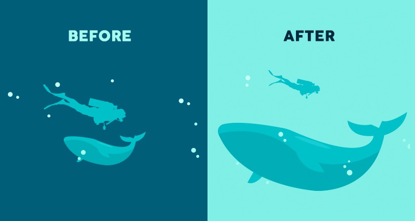
Credit: www.loop11.com
Importance In Design
Design thrives on visual hierarchy principles. These guide the viewer’s focus, ensuring important elements stand out. Clear hierarchy enhances understanding and keeps engagement high.
Visual hierarchy is a crucial element in design that can significantly impact how users interact with your content. It’s not just about making things look pretty; it’s about guiding the viewer’s eye to the most important elements first. By understanding and applying the principles of visual hierarchy, you can create designs that are not only aesthetically pleasing but also highly functional. ###What Is Visual Hierarchy?
Visual hierarchy is the arrangement of elements in a way that implies importance. This is achieved through variations in size, color, contrast, alignment, and spacing. When you enter a well-designed website, your eyes are naturally drawn to headlines or call-to-action buttons. This intentional design choice directs your attention to key information. ###How Does Size Influence Visual Hierarchy?
Size is one of the simplest ways to establish hierarchy. Larger elements draw more attention and can signify importance. Consider a newspaper where the headline is significantly larger than the body text. Your eyes are naturally drawn to the headline first, capturing the essence of the story before diving into details. ###Why Color And Contrast Matter?
Colors and contrast can evoke emotions and highlight elements. A red button on a white background catches the eye immediately. It stands out, prompting you to take action. Imagine scrolling through a website; without intentional use of color, you might miss the most important call to action. ###Alignment And Spacing: Unsung Heroes
Proper alignment and spacing create a clean and organized look. This makes information easier to digest. Misaligned text or cramped elements can confuse users and make navigation frustrating. Think of a time you visited a cluttered website. Did you find what you were looking for easily? ###The Role Of Fonts In Hierarchy
Fonts can subtly guide your perception. A bold, sans-serif font can make a statement, while a smaller, serif font might suggest supplementary information. You might have noticed how different font styles can alter your mood or perception of the text. Choosing the right font can help convey the right message. ###Practical Tips For Implementing Visual Hierarchy
– Prioritize content: Identify what’s most important and make it prominent. – Use whitespace: Give elements room to breathe, enhancing focus. – Test with users: Gather feedback to see if your hierarchy is intuitive. By considering these principles, you can enhance your design’s effectiveness. Ask yourself, is your design leading users effortlessly to the key information? If not, it might be time to reevaluate your visual hierarchy strategy.Typography Techniques
Typography techniques play a crucial role in visual hierarchy. They guide the viewer’s eyes to important information. Well-executed typography enhances readability and engagement. Different techniques include font size, weight, style, and contrast.
Font Size And Weight
Font size impacts how text stands out. Larger fonts grab attention quickly. Smaller fonts are used for less critical details. Weight refers to the thickness of the text. Bold weight emphasizes key points. Light weight provides subtlety and elegance.
Style And Contrast
Style includes italics, underline, and capitalization. Italics add emphasis to specific words. Underlining can highlight links or important details. Capitalization increases visibility for headings. Contrast involves using different colors and shades. High contrast between text and background improves readability.

Credit: www.nngroup.com
Color And Contrast
Color and contrast are vital in visual hierarchy. They guide the viewer’s eye. Effective use of these elements can make your design stand out. Color draws attention and evokes emotions. Contrast helps differentiate elements, enhancing readability and focus. Together, they create balance and clarity in design.
Creating Focal Points
Use bright colors to create focal points. These draw the viewer’s attention. A vibrant color against a muted background can highlight key information. Contrast further enhances this effect. Dark text on a light background is easy to read. This combination ensures important details aren’t missed.
Harmonizing Elements
Balance colors to harmonize design elements. Choose a color palette that complements your message. Too many colors can overwhelm the audience. Consistency in contrast and color maintains visual harmony. This balance keeps the design aesthetically pleasing. It also ensures a smooth visual journey for the viewer.
Layout And Composition
Visual hierarchy guides the eye through a design, emphasizing important elements. It uses size, color, and contrast to arrange content clearly. Effective layout and composition help convey messages efficiently.
### Layout and Composition How often have you found yourself confused while navigating a website? The layout and composition of a page can either make it easy for you to find what you need or leave you feeling lost. A well-structured layout is not just about looking pretty; it’s about guiding your eyes to the right places. Let’s dive into the essential principles of visual hierarchy with a focus on layout and composition. ####Grid Systems
Imagine walking into a room where everything is scattered; you wouldn’t know where to start. Similarly, a grid system acts as the framework that holds the design together. It helps align elements on a page, making it easier for you to digest information. Consider how newspapers use columns to guide your eyes from one story to the next seamlessly. Applying grid systems in web design works in the same way, ensuring that text and images are organized and easy to follow. ####White Space Utilization
Have you ever felt overwhelmed by too much information crammed into one space? White space, or the empty space around elements, is not wasted space. It’s like a breather for your eyes, helping you focus on what’s important without feeling cluttered. Think of white space as the pauses in a conversation; it gives you time to process what’s being said. By using white space effectively, you create a cleaner and more inviting layout that draws you in. By focusing on layout and composition, you can create an engaging visual hierarchy that guides your audience effortlessly. So, how will you utilize these principles to enhance your designs?Scale And Proportion
Scale and proportion are vital in creating visual hierarchy. They guide the viewer’s eyes to important elements. Larger elements grab attention. Smaller ones recede into the background. This balance helps communicate the message effectively.
Scale As A Tool For Emphasis
Scale draws attention to specific elements. Larger elements often appear more important. They capture the viewer’s focus first. This can be used to highlight key information. It helps in directing the viewer’s path through content.
Proportion In Layout Design
Proportion relates to the size of elements in relation to each other. Balanced proportions create harmony and order. This makes content easy to understand. Good proportion avoids clutter and confusion. It ensures each element has its place.
The Relationship Between Scale And Proportion
Scale and proportion work together to create visual impact. Proper use of both enhances readability. It guides the viewer’s journey through the design. This ensures a smooth and engaging user experience. Misusing them can lead to a chaotic layout.
Practical Application Of Scale And Proportion
Apply scale to highlight headlines or call-to-action buttons. Use proportion to maintain balance and harmony. A well-proportioned layout feels organized and inviting. It encourages viewers to engage more with the content. This can improve user interaction and satisfaction.
Alignment And Flow
Visual hierarchy relies on alignment and flow to guide the viewer’s eye naturally. Proper alignment creates order and balance, while flow ensures a seamless transition from one element to another, enhancing comprehension and engagement. Together, they form the backbone of effective design, emphasizing essential information and improving readability.
Understanding the nuances of alignment and flow can transform your visual content from merely good to outstanding. When elements in your design are aligned, they create an organized and professional look. This not only makes your content more aesthetically pleasing but also ensures your message is conveyed effectively. The flow, on the other hand, guides your audience seamlessly from one point to the next, improving comprehension and retention. Have you ever noticed how your eyes naturally follow a path when looking at a well-designed page? That’s the magic of alignment and flow at work.Directional Cues
Directional cues are visual signals that guide your viewer’s attention. These can be arrows, lines, or even subtle shapes that point towards important information. Using them strategically can enhance the user’s journey through your content. Imagine you’re reading a comic strip; each panel naturally leads you to the next. Applying similar cues in your design can keep your audience engaged and focused.Visual Balance
Visual balance ensures your design feels stable and harmonious. It’s about distributing elements so that no single part overpowers the others. Achieving this involves careful placement of text, images, and whitespace. Think of it like arranging furniture in a room; you want everything to have its place without clutter. The right balance makes your content more appealing and easier to digest, encouraging viewers to stick around longer. Have you ever rearranged your living room furniture and suddenly felt more relaxed in the space? Applying visual balance in your design can evoke a similar feeling in your audience. They’re more likely to absorb your message when everything feels just right.Visual Elements Prioritization
Visual Elements Prioritization is key in creating effective designs. It guides the viewer’s attention to the most important aspects. This principle ensures clarity and enhances user experience. Understanding how to prioritize visual elements can transform a design.
Primary And Secondary Elements
Primary elements are the focal points of a design. They grab the viewer’s attention first. These elements include headlines and images. They stand out due to their size and contrast. Secondary elements support the primary ones. They provide additional information. Smaller text and subtler colors often define them. Balancing these elements improves clarity. It prevents overwhelming the viewer.
Emphasizing Key Information
Highlighting key information ensures it is noticed. It uses visual techniques like color and bold text. These methods draw the eye to crucial details. Designers use spacing and alignment for emphasis. Properly emphasized information improves comprehension. It helps users find what they need quickly. Effective emphasis makes a design more engaging.
Practical Applications
Understanding visual hierarchy principles helps in organizing content effectively. Designers guide viewer’s attention using size, color, and spacing. This enhances readability and user experience on websites and apps.
Visual hierarchy is not just an abstract design concept; it’s a tool that can significantly enhance the usability and aesthetics of your projects. When applied practically, it helps you guide your audience’s attention, making the content more accessible and engaging. But how do you apply these principles effectively in different mediums like web design and print media? Let’s dive into some practical applications.Web Design
In web design, visual hierarchy plays a crucial role in user experience. A well-designed website directs the user’s gaze naturally to the most important elements. Think about the last time you visited an e-commerce site. What caught your eye first? Most likely, it was the product images or the “Buy Now” button. This isn’t accidental. Designers use size, color, and spacing to make sure these elements stand out. Consider using larger fonts for headings and smaller ones for body text. This simple change can significantly improve readability and flow. Additionally, contrasting colors for call-to-action buttons can make them pop, drawing immediate attention. Play around with alignment and whitespace to create a clean layout that guides the eye through content smoothly.Print Media
In print media, the principles of visual hierarchy help in organizing content in a way that captivates the reader. Newspapers and magazines often use bold headlines and captivating images to grab attention. Have you ever picked up a magazine and found your eyes drawn to a striking headline or an eye-catching image? That’s visual hierarchy at work. Use a grid system to align your text and images. This creates a structured look that makes your content easy to follow. Hierarchical typography is another tool. Varying font weights and sizes can establish a clear reading order, making it easier for your audience to digest information. In both web and print, testing different designs to see what resonates with your audience can provide valuable insights. What might work for one audience might not work for another. Are you ready to experiment and see which elements capture your audience’s attention best?Common Mistakes
Creating effective visual hierarchy can be challenging. Many designers make common mistakes. These errors can lead to confusion and frustration. Understanding these pitfalls helps in crafting better designs.
Overloading Information
Too much information overwhelms users. They struggle to find key details. Designers often try to fit everything on one page. This leads to cluttered layouts. Users may miss important content. Prioritize essential elements to enhance clarity.
Ignoring User Experience
Design should serve the user. Ignoring user experience can be costly. Users feel lost without clear navigation paths. Poor design choices hinder engagement. Consider user needs and expectations. Simplify interactions for better user satisfaction.
Future Trends
The digital design world is rapidly evolving. Visual hierarchy plays a crucial role. It guides users’ attention effectively. Designers constantly seek fresh approaches. Future trends will redefine visual hierarchy principles. Staying updated is essential for impactful designs.
Interactive Designs
Interactive elements enhance user engagement. They draw attention to key areas. Designers use animations and transitions. These elements make navigation intuitive. Interactive designs create a dynamic user experience. Users feel more involved with the content. Such designs also encourage exploration. They keep users on the page longer.
Adaptive Layouts
Adaptive layouts cater to different devices. They ensure a consistent experience. These layouts automatically adjust to screen size. This makes content easily accessible. Users can navigate without hassle. Adaptive layouts also improve readability. Consistent design across devices builds trust. It offers users a seamless experience.
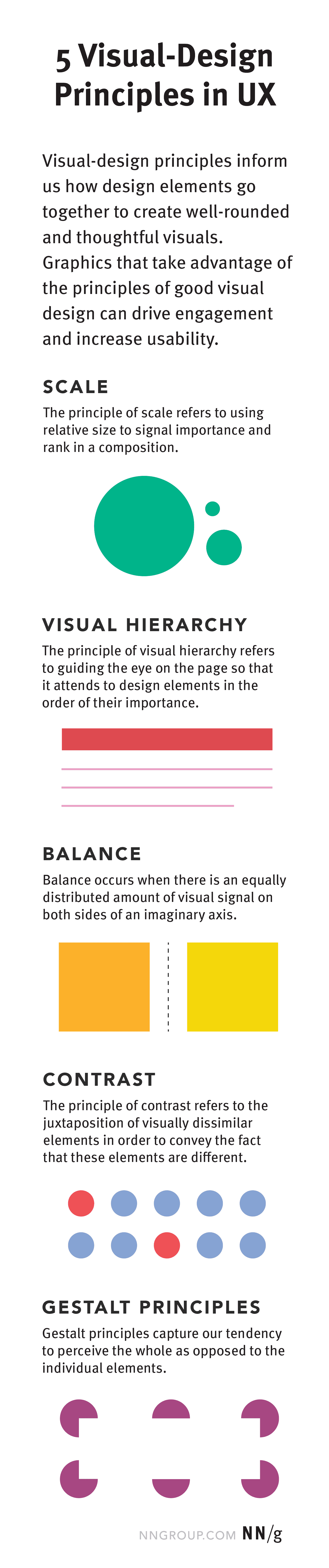
Credit: www.nngroup.com
Frequently Asked Questions
What Are The Principles Of Visual Hierarchy Design?
Visual hierarchy design principles include size, color, contrast, alignment, and proximity. These elements guide user attention effectively. Larger and bolder elements attract more focus. Contrasting colors and strategic alignment create visual interest. Proper spacing and grouping enhance readability and organization.
Implementing these principles improves user experience and engagement.
What Are The 5 Parts Of Visual Hierarchy In Typography?
The five parts of visual hierarchy in typography are size, weight, color, contrast, and alignment. Size determines prominence. Weight influences visibility. Color adds emphasis. Contrast creates distinction. Alignment ensures order. These elements guide the reader’s attention and enhance readability.
What Is The Principle Of Hierarchy?
The principle of hierarchy organizes elements in a system by their rank or importance. It creates structure and clarity. This concept is used in various fields like design, management, and biology. Hierarchy helps prioritize tasks and streamline processes effectively.
What Are The 7 Basic Principles Of Design?
The 7 basic principles of design are balance, contrast, emphasis, movement, pattern, rhythm, and unity. Each element ensures a cohesive and visually appealing design. These principles guide designers in creating functional and aesthetically pleasing layouts. Applying them effectively enhances user experience and communication.
Conclusion
Understanding visual hierarchy enhances design clarity and communication. It ensures important elements stand out. Designers can guide viewers’ eyes effectively. Simple techniques like contrast, size, and alignment work wonders. Consistent application builds a strong visual narrative. This keeps users engaged and improves user experience.
A well-structured layout reduces confusion. It also increases content accessibility. Practice these principles to create appealing designs. Your audience will appreciate the clarity. Visual hierarchy truly impacts design success. Keep experimenting with different elements. Find what works best for your audience.
Consistency and creativity are key. Happy designing!