Are you caught in the tug-of-war between web and print design? The debate is real, and it could be affecting your projects more than you realize.
Whether you’re a seasoned designer or just stepping into the creative world, understanding the nuances between these two mediums can transform your work and elevate your brand’s impact. We’re diving into the core differences and the unique strengths each medium offers.
You’ll discover how to make the best choice for your specific needs, ensuring your designs not only look stunning but also connect deeply with your audience. Stay with us, and let’s unveil which design path could be your ultimate resolution.

Credit: 236colortheory.weebly.com
Media Constraints
Designing for web and print requires different resolutions. Web design uses lower resolution for faster loading. Print design needs higher resolution for sharp images. Understanding these constraints ensures optimal visual quality across media.
In the ever-evolving world of design, media constraints play a crucial role in shaping how designers approach web and print projects. Whether you’re crafting a stunning website or designing an eye-catching brochure, understanding these constraints can make or break your project. They can affect everything from color choices to layout, and ultimately determine the impact of your design. As technology advances, the difference between digital and print media becomes even more pronounced. So, what should you consider when navigating these media constraints? ###Screen Vs. Paper
When designing for screens, you have to consider that devices vary widely. From smartphones to large desktop monitors, your design needs to be adaptable. This means ensuring your visuals are clear and engaging at all sizes. On the other hand, print design offers a fixed canvas. Whether it’s a business card or a billboard, you know exactly how your design will appear. This allows for precise control over elements like typography and spacing. Have you ever noticed how colors look different on your phone compared to a printed photo? That’s a direct result of media constraints. Designing with these differences in mind can enhance the user experience across platforms. ###Resolution And Dpi
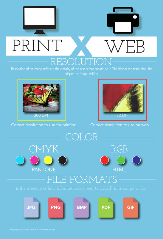
Resolution is a key factor in both web and print design. For digital media, resolution is measured in pixels. Higher resolutions result in sharper images, but they also require more data. This can lead to longer loading times, which might frustrate users. Print design, however, uses DPI (dots per inch) to measure resolution. A higher DPI results in better print quality. For instance, a 300 DPI image will look crisp in a magazine, while a lower DPI might appear blurry. Have you ever printed a picture that looked great on screen but fuzzy on paper? This is because screens generally display at 72 DPI, which isn’t sufficient for high-quality printing. By understanding these nuances, you can ensure your designs are effective in both mediums. As a designer, how do you balance these constraints? The key lies in knowing your audience and the medium they interact with. By tailoring your design to fit the unique qualities of web and print, you can create impactful and memorable experiences.Color Considerations
Choosing the right colors is essential in both web and print design. Colors can evoke emotions, set moods, and define brands. However, the way colors are displayed differs between digital screens and printed materials. These differences can impact how your design looks and feels.
Let’s dive into the essential aspects of color in design: the distinctions between RGB and CMYK and ensuring color consistency.
Rgb Vs. Cmyk
RGB is used for digital designs. It’s based on red, green, and blue light. Screens mix these colors to create millions of hues. It’s fascinating how you can adjust brightness to get the exact shade you want.
CMYK is for print design. It stands for cyan, magenta, yellow, and key (black). Printers combine these inks to reproduce colors. This process can sometimes feel like magic, seeing a design come alive on paper.
Have you ever noticed how a vibrant color on your screen sometimes looks dull in print? That’s because RGB colors often don’t translate well to CMYK. Always consider this difference when designing for both mediums.
Color Consistency
Ensuring color consistency is crucial. Your brand color should look the same on every medium. Imagine your logo looking different in print and online—it’s confusing and unprofessional.
Use color profiles to maintain consistency. These profiles help ensure colors remain true across different devices and printers. It’s like setting a universal language for your colors.
Test your colors regularly. Print a sample, view it on different screens, and adjust as needed. This proactive approach saves you from costly mistakes and ensures your design remains impactful.
Have you ever thought about how color perception varies among individuals? How can you ensure your design communicates the right message across diverse viewers? Consider color psychology and accessibility in your choices. After all, color isn’t just a visual element—it’s a communication tool.
Interactivity
Interactivity plays a crucial role in design, bridging the gap between users and content. It enhances user experience by making design more engaging. Web design and print design offer different levels of interactivity. Understanding these differences can help create effective strategies for each medium.
User Engagement
Web design excels at user engagement. It allows users to interact with content through clicks, scrolls, and animations. These elements make the web experience immersive. Print design lacks this direct interaction. Readers engage passively with print materials. They absorb information without interacting with the content.
Dynamic Content
Dynamic content is a hallmark of web design. Websites can change content based on user actions. This keeps the experience fresh and personalized. In contrast, print design is static. Once printed, content remains unchanged. This limits its ability to adapt to user preferences.
Web design offers tools like videos and interactive forms. These tools encourage user participation. Print design focuses on visual appeal and layout. It relies on typography and images to capture attention. While both have unique strengths, web design’s interactivity sets it apart.
Credit: designjourn.weebly.com
Layout Flexibility
Web design offers layout flexibility, adapting seamlessly to various screen resolutions. Print design requires fixed dimensions, ensuring consistent quality across physical formats. Understanding these differences helps create effective visuals for both digital and print media.
When discussing web versus print design, layout flexibility is a key factor that distinguishes the two. In web design, the layout is dynamic and adapts to different screen sizes, while print design is static and fixed. Understanding how layouts work in both mediums can help you create designs that are both functional and visually appealing. How flexible do you think your design needs to be?Responsive Design
Responsive design is a game-changer for web layouts. It ensures that websites look good on any device, whether it’s a smartphone, tablet, or desktop. This adaptability helps improve user experience and can make your site more accessible to a broader audience. You may have noticed how some websites seamlessly adjust when you resize your browser window. This is responsive design in action. It involves using flexible grids and layouts, images, and CSS media queries to adapt the design to the user’s environment.Fixed Vs. Fluid Layouts
Fixed layouts are like the classic print design—unchanging and predictable. They have set dimensions, which means they look the same on every screen. This can be useful for maintaining specific aesthetic or branding elements. On the other hand, fluid layouts stretch and contract based on the screen size. They use percentage-based widths, allowing elements to resize in proportion to the window or screen. Fluid layouts offer a more flexible option that can enhance usability on different devices. Choosing between fixed and fluid layouts depends on your design goals. Do you need consistency across devices, or is adaptability more important for your users? Understanding your audience and their needs can guide you in making the right choice. Incorporating layout flexibility in your design process can significantly impact how users interact with your content. Which approach aligns best with your design objectives?Typography
Typography is the cornerstone of effective design, whether it’s on the web or in print. It shapes the way information is presented and consumed. A well-chosen font can convey personality and mood, while poor typography can make content hard to read or unappealing. How do you make the right choices in web versus print design? Let’s explore some essential aspects of typography.
Font Choices
Your font choice sets the tone for your content. In web design, you have access to a vast library of fonts thanks to services like Google Fonts and Adobe Fonts. These platforms allow you to experiment and find a typeface that matches the message you want to send.
Print design traditionally offers a more limited selection. You often rely on classic fonts like Times New Roman or Arial that are tried and tested for readability. However, you can still bring creativity by exploring lesser-known typefaces that fit your brand’s voice.
Think about your audience. Are they reading on a screen or on paper? This should influence your font choice. Remember that web fonts need to be legible across different devices and screen sizes.
Scalability
Scalability is crucial in typography. On the web, text must be flexible to accommodate different screen resolutions and sizes. Responsive design ensures that your typography adjusts accordingly, maintaining readability across devices.
Print design, on the other hand, has a fixed size. You can be precise with font sizes and spacing, ensuring that your text is consistent from page to page. But this means you have less flexibility in adjusting text for different formats.
Consider how scalable your typography needs to be. Are you prepared to adjust your web fonts for mobile users? Do you have a plan for print designs that need to be repurposed for digital formats? Scalability can make or break the user experience.
Good typography is more than just choosing a pretty font. It’s about making sure your message is conveyed clearly and effectively. How can you improve the typography in your designs today?
Accessibility Standards
Accessibility is crucial in both web and print design. It ensures everyone can access and understand information. Designers need to consider different standards for each medium. This helps create a more inclusive environment. With the right approach, both web and print can be accessible to all users.
Digital Accessibility
Digital accessibility focuses on making online content usable for all. This includes people with disabilities. Websites must be compatible with screen readers. They should have alternative text for images. Clear navigation is essential. Consistent layouts help users move through content easily. Good contrast between text and background improves readability. Captions for videos ensure everyone gets the message. These elements make digital spaces more welcoming.
Print Legibility
Print legibility ensures printed materials are easy to read. Clear, large fonts make a big difference. They help people with vision impairments. Adequate spacing between lines improves readability. High contrast between text and background is key. This helps the text stand out. Simple language keeps messages clear. Avoid complex words that confuse readers. Effective print design is about clarity and simplicity.
Distribution Methods
Distribution methods vary significantly between web and print design. Each has its unique way to reach audiences. Understanding these methods helps in choosing the right design approach.
Online Reach
Web design offers extensive reach through digital platforms. Websites can be accessed globally with internet connection. Social media shares increase visibility. SEO helps in attracting organic traffic. Websites are often updated for fresh content. Email newsletters offer direct communication. Online ads target specific audiences effectively.
Print Circulation
Print design relies on physical distribution. Magazines and newspapers reach local audiences. Print ads appear in specific locations. Flyers and brochures are handed out directly. Limited copies can create exclusivity. Tangible materials have a lasting presence. Print often targets niche markets effectively. Distribution depends on logistics and availability.
Cost Implications
Understanding the cost implications is crucial in design. Web design and print design have different financial demands. Each has its own unique production costs and budget considerations. Let’s explore these aspects to make informed choices.
Production Costs
Web design often involves software costs. Designers need tools like Adobe XD or Sketch. Hosting and domain expenses add up. Maintenance can be ongoing. Print design requires physical materials. Paper and ink are essential. Printing services can be costly. Each method has distinct production challenges.
Budget Considerations
Web design budgets vary. Initial setup may be cheaper. Updates and redesigns can increase costs. Print design requires upfront investment. Bulk printing may reduce expenses. Limited changes mean fewer long-term costs. Budgeting depends on project scope and goals.
Design Tools
Understanding the difference in resolution is key for web and print design. Web design typically requires lower resolution, focusing on screen clarity. Print design demands higher resolution for sharp, detailed prints. Knowing these differences ensures optimal design quality for each medium.
Designing for web and print requires distinct tools. Each serves specific purposes. Web design tools cater to digital interfaces. Print design tools focus on physical media. Understanding these differences is key. It enhances the design process. Let’s explore this further.Software Differences
Web design often uses software like Adobe XD and Sketch. These tools create interactive prototypes. They focus on user experience. Print design relies on Adobe InDesign and Illustrator. These tools excel in layout and vector graphics. They ensure high-quality print results. Each software has unique features. Choosing the right one is crucial. It impacts the final design quality.Skill Requirements
Web design needs coding knowledge. HTML, CSS, and JavaScript are essential. They help in creating functional websites. Print design emphasizes color theory and typography. Designers must understand paper types and printing processes. Both require creativity and attention to detail. Mastering these skills takes practice. It differentiates good designers from great ones.
Credit: www.instagram.com
Frequently Asked Questions
Is Web Quality Better Than Print Quality?
Web quality often offers lower resolution compared to print quality. Print quality ensures sharp images and vibrant colors. Web images prioritize faster loading, sacrificing some detail. Overall, print quality is superior for visual clarity. For digital purposes, web quality is optimized for speed and accessibility.
What Resolution Should You Use For Screen Vs Print?
Use 72 DPI for screen resolution and 300 DPI for print resolution. Screen requires lower resolution, while print needs higher for clarity.
What Is The Dpi Of Print Vs Web?
Print typically uses 300 DPI for high-quality output. Web content usually requires 72 DPI for optimal performance.
Which Is Better, Graphic Design Or Web Design?
Choosing between graphic design and web design depends on your interests and career goals. Graphic design focuses on visual elements and creativity. Web design involves creating functional and interactive websites. Both fields offer rewarding careers, but web design often requires more technical skills.
Consider your strengths and preferences to decide.
Conclusion
Choosing between web and print design depends on your goals. Web design offers flexibility and real-time updates. Print design provides tangibility and a tactile experience. Consider your audience and message. Web design excels in interactivity and reach. Print design shines in elegance and permanence.
Both have unique strengths. Each serves different purposes effectively. Balance your needs and resources. Analyze which aligns better with your brand vision. Make informed decisions for success. Understanding these differences helps in crafting better strategies. Your choice impacts how your message is received.
Prioritize clarity and engagement in your design approach.