What’s the Difference Between Serif and Sans-Serif Fonts?
Fonts are everywhere. They help us read and understand. They also make words look good. Two main types of fonts are serif and sans-serif. This article will explain their differences.
What Are Serif Fonts?
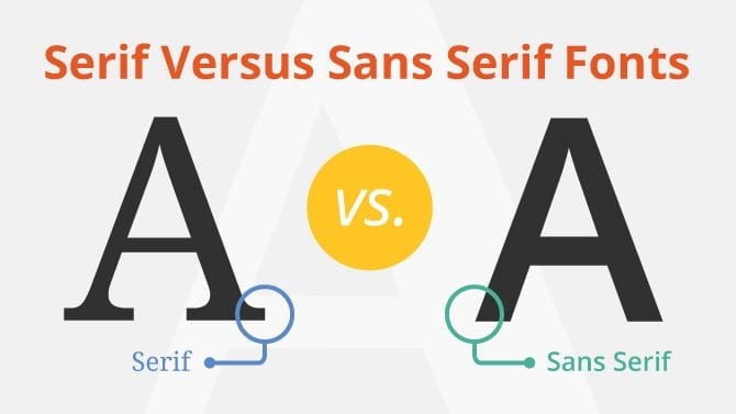
Serif fonts have small lines at the ends of letters. These lines are called “serifs.” They add a decorative touch to the letters. Serif fonts look classic and formal. They can feel elegant too.
Examples Of Serif Fonts
Times New Roman: A common font for books and newspapers.
Georgia: Great for reading on screens.
Garamond: Known for its beauty and style.
Bodoni: A stylish font used in fashion.
What Are Sans-Serif Fonts?
Sans-serif fonts do not have those small lines. The word “sans” means “without” in French. So, sans-serif means “without serifs.” These fonts look clean and simple. They often feel modern and friendly.
Examples Of Sans-serif Fonts
Arial: A very popular font for many uses.
Helvetica: Known for its clarity and simplicity.
Verdana: Designed for easy reading on screens.
Futura: A geometric font that looks stylish.
Key Differences Between Serif and Sans-Serif Fonts
Feature
Serif Fonts
Sans-Serif Fonts
Lines
Have small lines (serifs)
No lines (clean edges)
Style
Classic and formal
Modern and friendly
Use
Good for print
Great for screens
Readability
Helps in long texts
Clear and easy to read
When to Use Serif Fonts
Serif fonts are great for printed materials. They look good in books, newspapers, and magazines. The extra lines help guide the eye when reading long texts. This makes it easier to read pages of text.
When to Use Sans-Serif Fonts
Sans-serif fonts work well for digital use. They look sharp on screens. Websites, apps, and presentations often use them. These fonts are clear and easy to read. They keep things simple.
Combining Serif and Sans-Serif Fonts
Sometimes, people mix serif and sans-serif fonts. This can create a nice contrast. For example, use a serif font for headings. Then, use a sans-serif font for body text. This makes the text look interesting.
Font Choice and Branding
Choosing the right font matters. It can show your brand’s personality. Serif fonts can show tradition and stability. Sans-serif fonts can show modernity and friendliness.
How to Choose Between Serif and Sans-Serif
When choosing a font, think about your audience. Consider where the text will appear. If it’s for a print book, serif might work best. If it’s for a website, sans-serif could be better.
Test Your Fonts
Try different fonts. See how they look together. Check how easy they are to read. This helps you make the best choice.