Imagine walking into a room that instantly makes you feel calm and happy. How does that happen?
It’s all about the colors around you. Choosing harmonious color schemes can transform any space, whether it’s your home, office, or even the outfits you wear. But how do you make sure the colors you pick work well together and evoke the right emotions?
The answer lies in understanding how colors interact and affect your mood. This article will guide you through simple steps to create the perfect color harmony. You’ll discover how to blend colors like a pro, ensuring they work beautifully together to set the right tone and atmosphere. Ready to unlock the power of color in your world? Let’s dive in!
Color Theory Basics
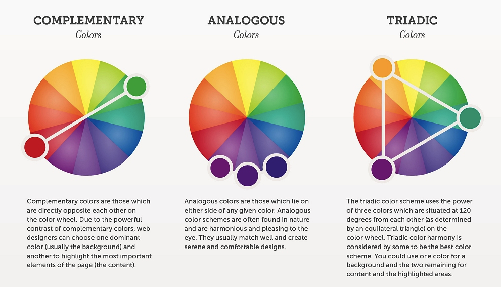
Color theory helps us choose colors that look good together. Primary colors are red, blue, and yellow. These colors cannot be made by mixing other colors. Secondary colors are made by mixing two primary colors. For example, red and blue make purple. Tertiary colors come from mixing a primary and a secondary color.
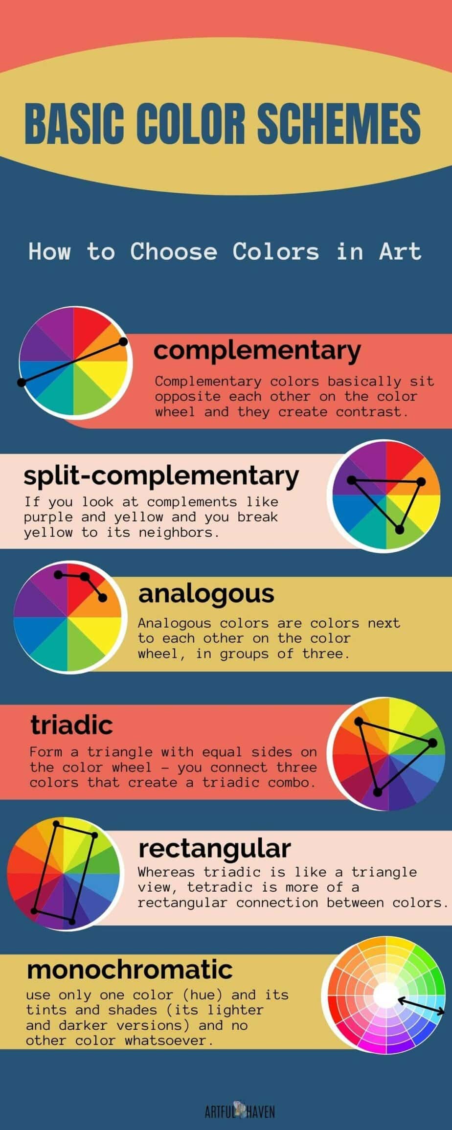
The color wheel is a tool that shows how colors relate. Complementary colors are opposite each other on the wheel. They create strong contrast. Analogous colors sit next to each other on the wheel. They create a calm and soothing look. Warm colors like red and orange feel energetic. Cool colors like blue and green feel calm.

Creating Balance And Contrast
Colors can make a room feel warm or cool. Balance is key. Use a mix of light and dark colors. This creates a pleasing look. Contrast makes colors pop. Try using opposite colors on the color wheel. This adds excitement to any space.
Pick a main color. Then choose a secondary color. Use the second color less than the first. Add a third color for accents. This three-color rule helps in creating harmony. Colors should feel right together. They should not fight each other.
Test colors on a small area first. See how they look together. Adjust if needed. This way, your space will look beautiful and balanced.
Tools And Resources For Designers
Designers use many tools to pick colors. Some tools are online and free. Others might need buying. Adobe Color is a favorite. It helps find color matches. Coolors is another tool. It lets you make color palettes fast. Canva Color Wheel is also good. It shows how colors work together.
Books can help too. “The Secret Lives of Color” is one such book. It tells stories about colors. Color Hunt is a website with many palettes. Designers like using it. There are also mobile apps. Palette is an app for making palettes. Designers can use it anywhere.
Conclusion
Choosing harmonious color schemes requires thought and creativity. Balance colors to enhance your design. Use nature as a guide for inspiration. Experiment with various shades to find the perfect match. Remember, colors impact mood and perception. Keep it simple and cohesive.
Trust your instincts and make adjustments. Your color choices can transform any space. With practice, creating a pleasing palette becomes easier. Dive in and explore the endless possibilities. Every color tells a story. Let your design speak vividly through colors.