Are you tired of your designs falling flat, lacking that spark to captivate your audience? Unlocking the secrets of effective layout and composition can transform your work from ordinary to extraordinary.
It’s not just about making things look pretty; it’s about creating a visual narrative that guides your viewer’s eye and evokes emotion. Imagine having the power to hold attention, convey messages clearly, and leave a lasting impression. By understanding the basic principles of layout and composition, you can do just that.
Dive into these fundamentals with us, and you’ll discover how to bring your creative visions to life in a way that resonates deeply with your audience. Ready to elevate your design game? Let’s get started.

Credit: pavilion.dinfos.edu
Visual Hierarchy
Visual hierarchy is a key concept in layout design. It guides the viewer’s eye, helping them understand what’s most important. Well-organized visual hierarchy enhances the user’s experience. It makes the content more accessible and engaging.
Importance Of Hierarchy
Hierarchy organizes information efficiently. It lets the audience focus on key elements first. This leads to better comprehension and retention. Good hierarchy builds a logical flow in design. It minimizes confusion and keeps the viewer’s attention on track.
Without hierarchy, designs can feel cluttered. Users might struggle to find relevant information. This can lead to frustration and disengagement. Hierarchy ensures clarity and order in layout. It helps deliver messages more effectively.
Methods To Establish Hierarchy
Size is a simple way to create hierarchy. Larger elements draw more attention. They signal importance and urgency. Contrast also plays a vital role. Bold colors or varying fonts can highlight essential information.
Positioning elements strategically enhances hierarchy. Placing key information at the top is effective. It ensures immediate visibility. Spacing is another useful tool. Generous spacing around important items increases focus.
Using repetition can establish hierarchy. Consistent elements help reinforce significance. They guide the viewer through the design smoothly. Remember, hierarchy is about guiding the viewer’s journey. It should feel natural and intuitive.
Balance And Alignment
Balance and alignment create harmony in layout design. They guide the viewer’s eye and ensure elements feel connected. Proper alignment makes content clear and easy to follow.
Creating a balanced and well-aligned layout is crucial for effective design. Balance and alignment can transform a cluttered space into something visually appealing. They are the backbone of good design, ensuring every element feels intentional and organized. Without them, even the most creative ideas can fall flat. ###Types Of Balance
Balance in design can be visualized in different forms. Symmetrical balance involves mirroring elements on either side of a central axis. It’s akin to looking at your reflection in a calm lake. This type of balance is reliable and brings a sense of order. Asymmetrical balance, on the other hand, uses contrasting elements to create harmony. Imagine a seesaw where a heavy weight on one side balances with multiple lighter weights on the other. It’s dynamic and can make a design feel more lively and engaging. Lastly, there is radial balance, where elements radiate from a central point. Picture the petals of a sunflower. It draws the viewer’s eye to the center and is often used to highlight focal points in a design. ###Role Of Alignment In Design
Alignment is your secret weapon in guiding the viewer’s eye through your design. It creates a visual connection between elements, making the layout easier to navigate. Think of alignment as the invisible thread that ties your design together. Proper alignment can instantly make a design look polished and professional. Imagine reading a page where text lines up perfectly with images. It feels satisfying, doesn’t it? Alignment helps avoid a chaotic look and keeps everything in its rightful place. Consider the impact of poor alignment. Even the most beautiful elements can look awkward if they’re not properly aligned. Have you ever felt uneasy looking at a lopsided picture frame? That’s the power of alignment at play. It’s crucial for maintaining visual harmony. Balance and alignment might seem like simple concepts, but they hold the power to elevate your designs. Are you using them to their full potential in your projects? Take a moment to evaluate and adjust, and watch your designs transform.Contrast And Emphasis
Contrast and emphasis are vital in layout and composition. They guide the viewer’s eye and highlight key elements. Effective use of contrast can make designs pop. Emphasis draws attention to important areas. Together, they create a dynamic and engaging visual experience.
Creating Contrast
Contrast helps elements stand out. Use different colors to create contrast. Light colors against dark ones catch attention. Bold fonts contrast with regular fonts. Shapes can also provide contrast. Pair circles with squares to create interest. Contrast is more than color. It includes size and texture too. Varying these can enhance visual appeal.
Using Emphasis Effectively
Emphasis highlights key parts of a design. It directs the viewer’s focus. Use size to emphasize an element. Larger objects often draw more attention. Color can also create emphasis. Bright colors stand out in a muted palette. Placement is crucial for emphasis. Center important elements for maximum impact. Emphasis helps communicate the main message.
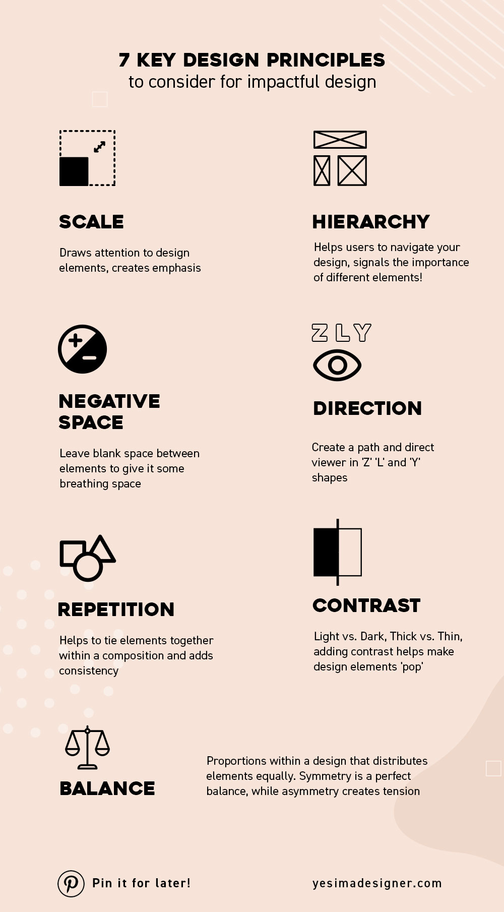
Credit: yesimadesigner.com
Repetition And Consistency
Repetition and consistency help create a balanced layout. They unify elements and guide the viewer’s eye smoothly across the page. This principle ensures harmony and strengthens the overall design impact.
When it comes to design, repetition and consistency are the unsung heroes that bring order and coherence to any layout. These principles are crucial in creating a visually pleasing experience that guides the viewer’s eye seamlessly across a page. They ensure that your design feels unified and professional, making it easier for your audience to engage with your content.Building Cohesion
Repetition works like a glue that holds different elements of your design together. Think of it as the thread that ties together colors, fonts, and shapes across your project. For example, using the same font for all your headings creates a rhythm that your audience can easily follow. This repetition not only improves readability but also strengthens brand recognition. Have you ever noticed how certain brands are instantly recognizable just by their color scheme or typography? That’s the power of consistent repetition. It builds trust and makes your work memorable.Benefits Of Consistent Design
Consistency makes your design predictable in a good way. It establishes a familiar pattern that helps users know what to expect. This is crucial in user interfaces where unexpected changes can lead to frustration. Imagine navigating a website where each page has a different layout. Confusing, right? Consistent design eliminates this chaos, allowing users to focus on your content without unnecessary distractions. A consistent design also enhances professionalism. When your design elements are uniform, it reflects attention to detail and care. Whether you’re designing a website or a business card, consistency signals that you are serious about your brand. Have you considered how consistency impacts your brand’s credibility? A cohesive design can be the difference between your audience trusting you or moving on to a competitor. Is your current design as consistent as it could be? Small tweaks can lead to significant improvements.Proximity And Spacing
Proximity and spacing help organize design elements clearly. Group related items together to show connection. Leave enough space between items to make them distinct. This principle enhances readability and visual appeal, guiding the viewer’s eye effortlessly across the layout.
When designing anything, whether it’s a website, brochure, or even a simple flyer, understanding the principles of proximity and spacing can make a significant difference. These principles guide the viewer’s eye and help communicate your message clearly. Proper proximity and spacing can turn a cluttered design into something harmonious and easy to digest. But how do you achieve this balance? ###Grouping Related Elements
Think about how your mind processes information. You naturally group related items together. This is why grouping related elements in your design is crucial. When elements are close to each other, they form a single visual unit. This makes it easier for viewers to identify and understand the connection between them. If you’re designing a website, consider placing related buttons or links in close proximity to each other. This will guide your audience and make navigation intuitive. Grouping related elements isn’t just about visual appeal; it improves functionality. Imagine trying to find contact information scattered across different pages. Frustrating, right? ###Optimal Use Of White Space
White space isn’t just “empty” space; it’s a powerful tool. It can highlight important elements and give your design room to breathe. Have you ever looked at a page and felt overwhelmed by too much text or too many images? That’s usually because there’s a lack of white space. By strategically placing white space around text and images, you can make your content more digestible. White space can also create a sense of elegance and sophistication. Think of high-end brands that use plenty of it in their advertisements. It draws your focus to the product and conveys a sense of exclusivity. But here’s a question: How do you decide how much white space is enough? The answer lies in the purpose and audience of your design. If your design is for a tech-savvy audience, you might opt for less white space to fit more information. On the other hand, a minimalist design might call for more. In your next design project, experiment with proximity and spacing. You’ll likely find that these simple adjustments can create a more effective and engaging design.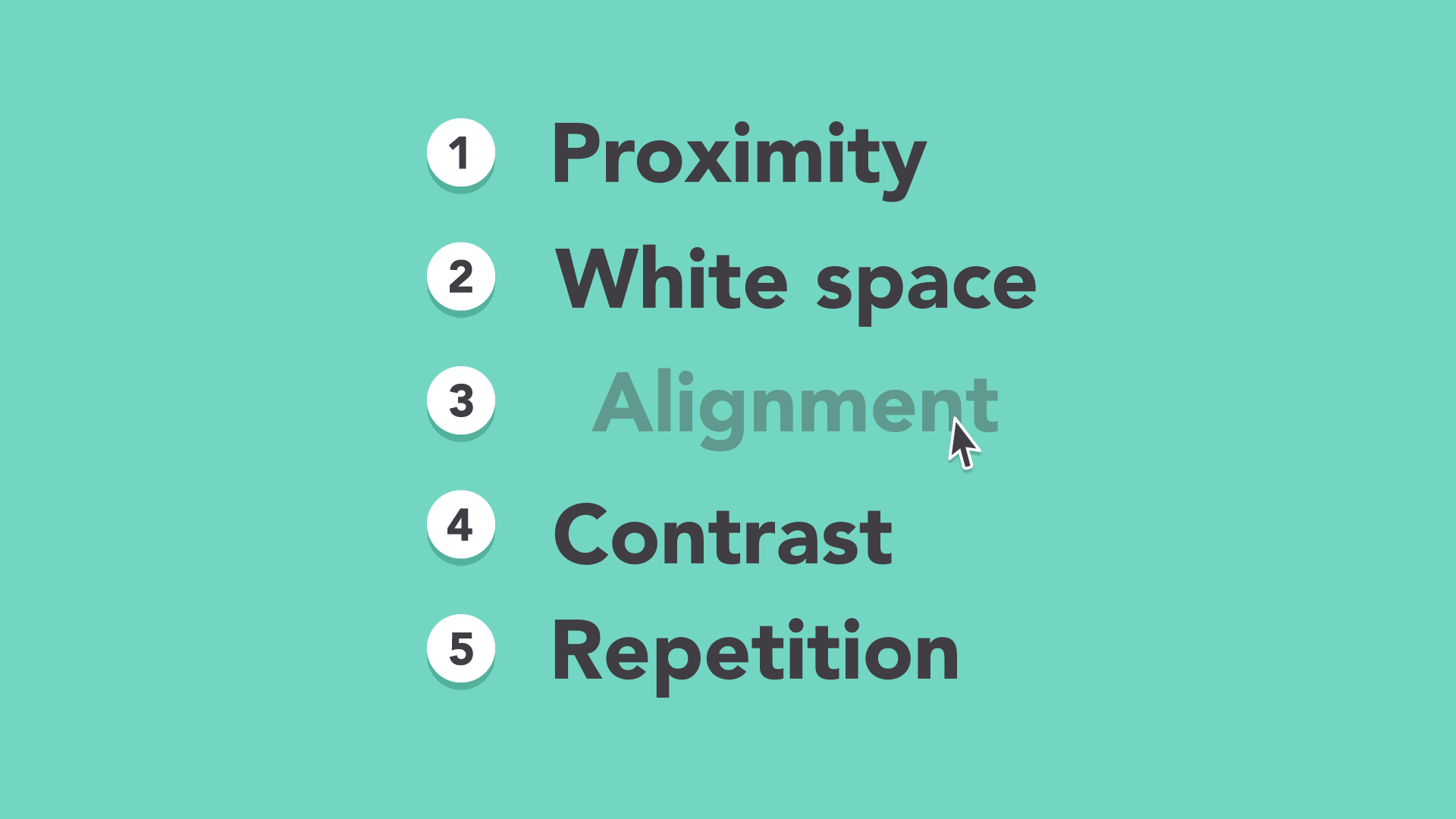
Credit: edu.gcfglobal.org
Color And Typography
Color and typography are the backbone of effective design. They communicate ideas and evoke emotions. Together, they enhance the visual appeal and readability of any layout. Choosing the right colors and fonts can transform a simple design into a captivating one. Understanding these elements is crucial for creating compelling compositions.
Choosing A Color Palette
Colors set the mood and tone of a design. They influence how viewers feel and react. A well-chosen color palette can guide the viewer’s attention. It can highlight important areas and create harmony. Start with a base color that aligns with the message. Then, add complementary colors to enhance the overall look. Limit the palette to three or four colors for simplicity. Test the color scheme for contrast and readability.
Typography As A Design Tool
Typography goes beyond just choosing fonts. It shapes the design’s personality and voice. Use typography to add emphasis and hierarchy. Select fonts that reflect the design’s theme and purpose. Mix serif and sans-serif fonts for balance. Ensure that the text is readable at various sizes. Experiment with font weights to create dynamic compositions. Proper spacing between letters and lines improves clarity.
Grids And Layouts
Grids and layouts form the backbone of design. They organize content, making it easy to read and visually appealing. A well-structured layout guides the viewer’s eye and enhances the overall experience. Grids provide the framework for this structure, ensuring consistency and balance. Understanding grids and layouts can transform a chaotic design into a harmonious one.
Understanding Grid Systems
Grid systems are like blueprints for design. They divide a page into sections, creating a structured layout. These divisions help in organizing content logically. Designers often use columns and rows to form a grid. This method ensures alignment and balance across the design. Grids also make responsive design easier. They allow for fluid adjustments across different screen sizes.
Using grids can simplify the design process. They provide a consistent framework to work within. This consistency is crucial for creating professional-looking layouts. It’s like following a map when creating a complex design. Without a grid, designs can appear disorganized or chaotic.
Creating Effective Layouts
An effective layout captures attention and guides the viewer. The placement of elements affects how a viewer perceives the content. Visual hierarchy is key. It involves arranging elements by importance. Larger elements draw attention first, guiding the viewer naturally.
White space is another essential aspect of layout design. It gives breathing room, enhancing readability and focus. A cluttered layout overwhelms the viewer. Balancing content with ample white space creates a clean, inviting design.
Grid-based layouts help maintain this balance. They ensure elements are evenly spaced and aligned. This structured approach leads to a cohesive, visually pleasing design. Even simple layouts benefit from a grid system. It adds professionalism and clarity to any project.
Responsive Design
Responsive design ensures websites look good on all devices. It adapts layouts for different screen sizes. This approach improves user experience and accessibility. With more people using mobile devices, responsive design is crucial. It helps websites remain functional and visually appealing.
Adapting To Different Screens
Websites must adjust to various screen sizes. This includes phones, tablets, and desktops. A flexible grid system is essential. It allows elements to resize smoothly. Images should also be scalable. This prevents them from looking distorted. Use media queries to fine-tune layouts. They enable different styles for different devices. This enhances readability and engagement.
Maintaining Consistency Across Devices
Consistency is key in responsive design. Users expect a similar experience on all devices. Uniform branding strengthens user trust. Typography and colors should remain consistent. Navigation must be simple and intuitive. This helps users move easily between devices. Consistent design boosts brand identity. It makes websites memorable and reliable.
Frequently Asked Questions
What Are The 5 Basic Principles Of Layout And Composition?
The five basic principles of layout and composition include balance, alignment, repetition, contrast, and proximity. Balance ensures visual stability, alignment creates order, repetition strengthens design cohesion, contrast emphasizes elements, and proximity groups related items together for clarity. These principles guide effective and appealing design layouts.
What Is The 7 Principle Of Layout?
The seven principles of layout are balance, contrast, emphasis, rhythm, unity, alignment, and proximity. These principles guide effective design, ensuring visual harmony and clear communication. Balance involves equal distribution, contrast highlights differences, emphasis draws focus, rhythm creates flow, unity ensures cohesiveness, alignment organizes elements, and proximity groups related items.
What Are The 5 Main Elements Of Composition Design?
The five main elements of composition design are line, shape, color, texture, and space. Lines create direction. Shapes define areas. Color adds mood and emphasis. Texture provides depth and interest. Space organizes elements, creating balance and focal points. Together, they form visually appealing and effective designs.
What Are The 8 Principles Of Design And Layout?
The 8 principles of design and layout are balance, contrast, emphasis, movement, pattern, rhythm, unity, and proportion. These principles guide the arrangement and organization of visual elements, enhancing aesthetics and functionality. They ensure effective communication and create visually appealing designs.
Conclusion
Understanding layout and composition enhances your design skills. These principles guide creativity. They help balance visual elements. A good layout creates harmony. It ensures clarity. Effective composition draws attention. It keeps viewers engaged. Use space wisely. Align elements thoughtfully. Choose colors carefully.
Remember, simplicity is powerful. Focus on hierarchy. Highlight key information. Every element should serve a purpose. Practice these basics. Improve your design projects. Make your work visually appealing. Boost communication through design. Let your creativity shine. Keep learning and experimenting.
Designing is a journey. Enjoy the process.