Fonts are everywhere. They shape the way you perceive information, influence your mood, and even affect how you remember things.
Two of the most common types of fonts are serif and sans-serif. Understanding the difference between these two can unlock a new level of control over your design projects, whether you’re crafting a website, designing a logo, or simply choosing a font for your next presentation.
Have you ever wondered why certain fonts seem more formal while others feel modern and clean? Or why some fonts are easier to read in long paragraphs? By diving into the world of serif and sans-serif fonts, you’ll discover the subtle ways they can impact your message and grab your audience’s attention. This isn’t just about aesthetics—it’s about optimizing your content to resonate with your viewers on a psychological level. Stick with us, and you’ll gain insights that could transform the way you communicate visually, leaving a lasting impression that keeps people engaged and coming back for more.
Credit: typetype.org
Serif Fonts
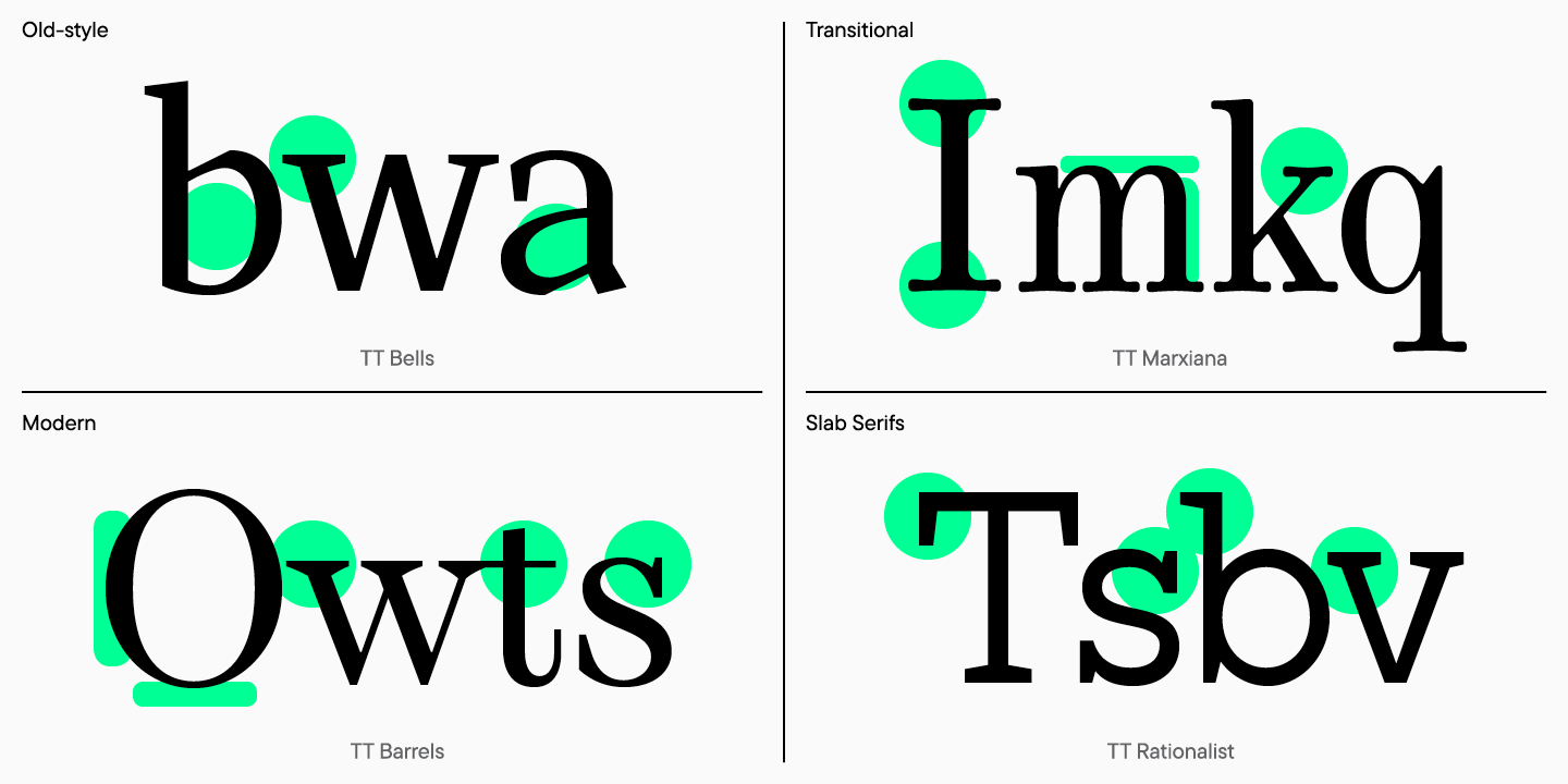
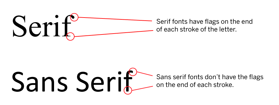
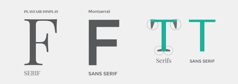
Serif fonts are classic and timeless. They are often seen in books and newspapers. The small lines or strokes attached to the end of larger strokes define serif fonts. These details, or “serifs,” give the font its name. Serif fonts are known for their readability. They guide the reader’s eye smoothly across the text.
Characteristics Of Serif Fonts
Serif fonts have unique traits. They feature small strokes at the ends of letters. This detail adds elegance to the text. The fonts often appear formal and traditional. They convey professionalism and authority.
History And Origins
Serif fonts have a rich history. They date back to ancient Rome. Stone carvers used them for inscriptions. Over centuries, serif fonts evolved. They became popular in print. Their readability made them a favorite for books.
Popular Serif Fonts
Several serif fonts are well-known. Times New Roman is a classic choice. It is widely used in print and digital media. Garamond is another popular serif font. It is elegant and easy to read. Georgia offers a modern twist on traditional serif styles.
Use Cases For Serif Fonts
Serif fonts suit various applications. They are ideal for printed books and newspapers. Their readability is perfect for long texts. Businesses use them in formal documents. They convey trust and professionalism. Websites use them for a classic look. They are often found in logos and branding.
Credit: ittrainingcontent.iu.edu
Sans-serif Fonts
Sans-serif fonts are clean and modern, without decorative strokes at the ends of letters. They offer a straightforward appearance, enhancing readability in digital formats. Popular choices include Arial and Helvetica, widely used in web design for their simplicity and clarity.
Sans-Serif fonts are everywhere. They’re on your favorite websites, in your phone’s interface, and even in the app you use to order your morning coffee. But what makes these fonts so popular and versatile? Let’s dive into the world of Sans-Serif fonts and uncover their characteristics, evolution, and practical uses.Characteristics Of Sans-serif Fonts
Sans-Serif fonts are clean and simple. They lack the small decorative strokes at the ends of letters known as serifs. This absence makes them appear more modern and straightforward, which can enhance readability on screens. Think of fonts like Arial or Helvetica; they deliver clear and concise messages without the distraction of ornate details. This simplicity makes them ideal for digital consumption.Evolution And Development
The journey of Sans-Serif fonts is fascinating. They emerged in the 19th century as a rebellion against the ornate styles that dominated print. Early Sans-Serifs were used sparingly, mostly for headlines. However, with the rise of digital media, their popularity soared. Designers embraced their minimalist appeal, leading to continuous refinement. Now, they are a staple in both print and digital design.Popular Sans-serif Fonts
Some fonts have become household names. Arial is often the go-to for documents, known for its readability and versatility. Helvetica is beloved by designers for its neutrality and balance. Futura offers a geometric flair, perfect for modern brands. These fonts have stood the test of time, each bringing unique attributes to the table. Which one resonates with your style?Use Cases For Sans-serif Fonts
Sans-Serif fonts are not just for techies and designers. They’re highly versatile across different contexts. Use them for digital interfaces where clarity is crucial. In branding, they convey modernity and sophistication. They also work well in presentations, ensuring your message is clear. Consider the impact of your font choice—how does it shape your communication? You might think choosing a font is trivial, but it can transform your content’s effectiveness. Do you find yourself gravitating towards Sans-Serif fonts for their clean lines and modern feel? Or do you prefer the classic elegance of Serif fonts? Your choice speaks volumes about your style and approach to communication.Comparing Serif And Sans-serif
Fonts play a crucial role in design. They influence the mood and tone of content. Understanding their differences helps in choosing the right one. Serif and sans-serif fonts are two main categories. Each has unique characteristics. Comparing them can guide designers in selecting the best font for their projects.
Visual Differences
Serif fonts have small decorative lines. These lines extend from the letters. They give a classic look. Sans-serif fonts lack these lines. They appear clean and modern. The style difference is immediately noticeable. Serif fonts are more traditional. Sans-serif fonts offer simplicity.
Legibility And Readability
Serif fonts excel in printed material. Their decorative lines help guide the eye. This enhances legibility in books and newspapers. Sans-serif fonts are preferred for digital screens. Their clear lines make them easier to read online. Choosing between them depends on the medium.
Psychological Impacts
Fonts evoke emotions. Serif fonts suggest reliability and tradition. They are used in formal documents. Sans-serif fonts convey modernity and simplicity. They suit casual and contemporary content. The choice affects how readers perceive the message.
Choosing The Right Font
Serif fonts have small lines attached to the end of strokes, giving a traditional look. Sans-serif fonts lack these lines, offering a clean, modern appearance. Choosing between them depends on the tone and readability you desire for your text.
Choosing the right font can be a game-changer for any design project. The font you select not only affects readability but also sets the tone and mood of your content. Whether you’re crafting a logo, designing a website, or putting together a print publication, your choice between serif and sans-serif fonts can make a big difference.Factors To Consider
When picking a font, start by considering your audience. Who will be reading your content? A professional report might benefit from a classic serif font like Times New Roman, which conveys tradition and reliability. On the other hand, a modern tech blog might better suit a sleek sans-serif font like Arial, which gives a contemporary feel. Also, think about readability. Serif fonts, with their small projecting features, are often easier to read in print. Sans-serif fonts, without these strokes, are commonly used on screens for clarity. Which medium will your audience use the most?Contextual Application
The context in which your font appears is crucial. Will it be in a formal document or an informal social media post? A wedding invitation might thrive on the elegance of a serif font like Garamond, creating a sense of celebration and intimacy. Alternatively, a startup’s pitch deck might opt for sans-serif fonts like Helvetica, emphasizing innovation and simplicity. Consider the emotional response you wish to elicit. Different fonts can convey distinct emotions and messages. Serif fonts often suggest tradition and authority, while sans-serif fonts can feel more approachable and modern.Trends In Font Design
Font trends are ever-evolving. Minimalist designs are currently popular, favoring clean lines and simple sans-serif fonts. However, retro serif fonts are making a comeback, adding a vintage flair to modern designs. Variable fonts, which allow for more flexibility in weight and style within a single font family, are also gaining traction. They offer designers more creative freedom without the need to switch between different fonts. Are you ready to experiment with the latest trends, or do you prefer sticking with the classics? Embracing trends can keep your design fresh but always align them with your brand identity. Choosing the right font involves more than just picking what looks good. It requires understanding your audience, considering the context, and being aware of current trends. So next time you’re faced with a font choice, remember these factors, and your design will surely stand out.Combining Serif And Sans-serif
Combining serif and sans-serif fonts creates visual interest. It adds depth to your design. This technique blends tradition with modernity. Serif fonts offer elegance. Sans-serif fonts deliver simplicity. Together, they balance each other. This harmony attracts the viewer’s eye. It enhances readability and keeps attention.
Design Harmony
Design harmony is crucial in font pairing. Serif fonts have decorative strokes. They convey a classic feel. Sans-serif fonts lack these strokes. They appear clean and contemporary. When combined, they create a pleasing contrast. This contrast leads to a balanced design. It avoids clutter and confusion.
Tips For Successful Pairing
Successful pairing requires attention to detail. Choose fonts with similar x-heights. This ensures consistency. Align your fonts’ weight and size. It maintains visual balance. Consider your design’s mood. Match fonts to the intended message. Test your combinations. View them on different devices.
Examples Of Effective Combinations
Some combinations stand out. Georgia and Arial work well together. Georgia offers warmth. Arial provides clarity. Another example is Times New Roman paired with Helvetica. Times New Roman adds sophistication. Helvetica gives a modern touch. These pairs create contrast. They enhance your design’s appeal.
Credit: about.easil.com
Frequently Asked Questions
What Are Serif And Sans-serif Fonts?
Serif fonts have small lines or strokes attached to the ends of letters. Sans-serif fonts lack these decorative strokes, offering a cleaner and more modern look. Serif fonts are often used in print, while sans-serif fonts are popular in digital formats for their readability on screens.
What Font Is Both Serif And Sans Serif?
Optima is a font that combines serif and sans-serif elements. It features clean lines and slight curves. This versatile font suits both formal and informal settings, maintaining readability and elegance.
What Are The 5 Main Types Of Fonts With Examples?
The five main types of fonts are: Serif (Times New Roman), Sans Serif (Arial), Script (Brush Script), Monospace (Courier), and Decorative (Papyrus). Each style serves different design purposes, enhancing readability and aesthetic appeal in various contexts.
What Is One Rule When Combining Fonts?
Choose fonts with contrasting styles to create visual interest. Pair a serif with a sans-serif for balance. Ensure readability by maintaining a harmonious size and weight difference. Limit combinations to two or three fonts. Consistency in font usage across design elements enhances coherence and appeal.
Conclusion
Serif and sans-serif fonts serve different design purposes. Serif fonts offer a classic look, perfect for print. Sans-serif fonts feel modern and clean, ideal for screens. Choosing between them depends on your project’s goal. Consider readability and the audience’s preference.
Mixing both can create visual interest. Test fonts on various devices for best results. Remember, font choice impacts your message’s tone. Select wisely to enhance your design’s effectiveness. The right font can make your content more engaging. Keep experimenting to find the perfect fit for your needs.