Are you struggling to make your information clear and engaging? Whether you’re designing a website, crafting a presentation, or writing an article, the way you organize and present your data can make all the difference.
This is where hierarchy in information design comes into play. Imagine being able to guide your audience effortlessly through your content, making sure they notice what’s important without feeling overwhelmed. Sounds great, right? By understanding and applying the principles of hierarchy, you can transform your content into something your audience finds both appealing and easy to navigate.
Curious about how this works? Keep reading to unlock the secrets of effective information design that will captivate your audience and enhance their experience.
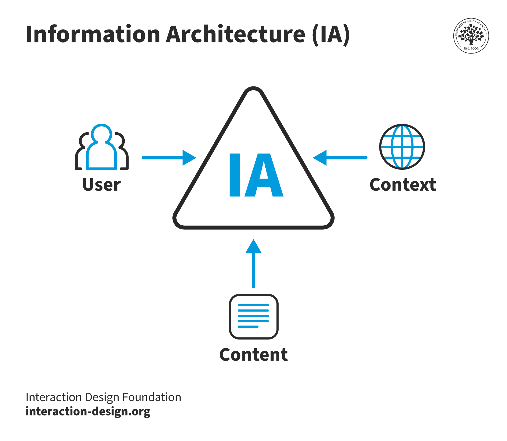
Credit: www.interaction-design.org
Principles Of Information Hierarchy
Understanding the principles of information hierarchy is crucial in crafting effective designs that convey messages clearly. These principles guide the organization of information in a way that naturally leads your audience through the content. They help you decide what needs to stand out and what should subtly support the main message. Do you ever wonder why some designs grab your attention instantly while others leave you confused? The secret often lies in the skillful application of information hierarchy principles.
Visual Weight And Balance
Visual weight refers to how prominent or noticeable an element is within a design. You can add visual weight through size, color, or texture. Imagine a large, bold title; it naturally draws your eyes first. Balance, on the other hand, is about distributing visual elements evenly to avoid overwhelming the viewer. Think of it like arranging books on a shelf; too many on one side may cause the shelf to tip.
By carefully managing visual weight and balance, you guide the viewer’s eyes in the intended order. Next time you design, ask yourself: Does your composition feel stable? Are the important elements getting enough attention?
Contrast And Emphasis
Contrast creates a distinction between elements, making them stand out. You can achieve contrast with color differences, varying shapes, or differing font sizes. Emphasis is about spotlighting the main message or key point. It’s like highlighting text in a book; your eyes are drawn to what’s important.
Consider using a bright color for key information against a muted background. This technique instantly elevates the importance of that information. What elements can you adjust to make your message shine?
Alignment And Proximity
Alignment ensures that elements are orderly, creating a sense of harmony. Imagine a neat row of text that feels organized and easy to read. Proximity groups related items together, helping viewers understand how they connect. It’s like seating friends next to each other at a dinner table; the closeness suggests a relationship.
Use alignment to maintain order and proximity to show connections. Are your related elements close enough to suggest their relationship? Does your design feel organized or chaotic?
By mastering these principles, you can transform your designs into engaging experiences that communicate effectively. Dive into your next project with these insights in mind, and watch your audience respond with clarity and interest.

Credit: www.infotech.com
Role Of Typography
Typography plays a vital role in information design. It guides the reader’s eye and impacts the user’s experience. Good typography makes content more readable and engaging. It helps in organizing information and creating visual hierarchy.
Effective typography can lead to better comprehension. It influences how information is perceived and processed. Choosing the right typography is essential for clear communication.
Font Choices
Font choice affects how your message is received. Different fonts convey different emotions and tones. Serif fonts are often seen as traditional and trustworthy. Sans-serif fonts appear modern and clean. Fonts must align with the content’s purpose and audience.
Using too many fonts can confuse the reader. Stick to two or three fonts for consistency. This helps in maintaining a clean and professional look. The right font choice enhances readability and supports the message.
Size And Scale
Size and scale create emphasis and structure in text. Larger fonts draw attention and highlight key points. Smaller fonts are used for secondary information. Consistent scaling helps the reader navigate through content easily.
Varying font sizes establish a clear hierarchy. They guide the reader’s eye from important to less important information. Proper scaling ensures a balanced and organized layout.
Hierarchy In Text
Hierarchy in text is crucial for effective information design. It organizes content and makes it easy to follow. Headers, subheaders, and body text each have a role. They break down information into digestible sections.
Using bold or italics can emphasize certain words. This helps in highlighting essential information. Establishing a clear hierarchy aids in better understanding and retention.
Color In Hierarchy
Colors guide the viewer’s attention in information design, establishing a clear visual hierarchy. Bright colors highlight important elements, while muted shades provide context. This approach helps in organizing data, making it easier for audiences to understand.
Color plays a crucial role in establishing hierarchy in information design. It guides your eyes, influences your emotions, and can even dictate the importance of elements in a layout. When used effectively, color enhances the readability and aesthetic appeal of a design, allowing users to navigate through information effortlessly. But how do you harness the power of color to create a clear hierarchy? Let’s explore some practical insights through color psychology, contrast and clarity, and color coding techniques.Color Psychology
Colors evoke emotions and can influence how you perceive information. Think about how a vibrant red can signal urgency, while a soothing blue suggests calmness. Consider using colors that align with the message you want to convey. If your design needs to instill trust, shades of blue might be your best bet. Reflect on your personal experience: Have you ever felt drawn to an advertisement simply because the colors resonated with your mood or interests?Contrast And Clarity
Contrast is key to making sure important information stands out. High contrast between colors ensures clarity and readability, particularly for text. Imagine reading a text in light gray against a white background. Frustrating, right? It’s essential to choose contrasting colors to highlight key elements. Ask yourself, does the contrast in your design help guide the viewer’s attention, or does it make them squint to decipher the message?Color Coding Techniques
Color coding is a powerful technique to organize information. It allows users to visually categorize data quickly. Think of a subway map where different lines are represented by distinct colors. This makes it easy to follow your route without confusion. Consider implementing color coding in your design to differentiate sections or elements. How can you use color to create a visual roadmap for your audience? Incorporating color in hierarchy is not just about aesthetics—it’s about enhancing user experience. As you design, think about how you can strategically use color to guide and engage your audience.
Credit: www.infotech.com
Use Of Imagery
Imagery guides the viewer’s eye, establishing visual hierarchy in information design. Pictures, colors, and shapes direct attention and emphasize key elements. This structured approach enhances clarity and engagement, making information easily accessible and memorable.
In the world of information design, imagery plays a crucial role in guiding the viewer’s attention and enhancing understanding. Think about the last time you were drawn to a magazine article or a website. Chances are, it was the images that caught your eye first. Imagery isn’t just about making things look pretty; it’s about creating a visual hierarchy that helps you process information more efficiently. Let’s dive into how different types of imagery can be used effectively in information design.Iconography
Icons are like the punctuation marks of visual language. They provide quick cues that help users navigate content. A well-designed icon can convey an idea or action faster than words can. Imagine a shopping cart icon on an e-commerce site—it instantly signals where to click to view your purchases. Icons should be simple, easily recognizable, and used consistently throughout your design. This consistency builds familiarity and makes users more comfortable with your interface. Ask yourself: are your icons intuitive enough to guide users without a second thought?Photography And Graphics
Photos and graphics add depth to your information, making it more relatable and easier to digest. A well-chosen photograph can evoke emotion, set the tone, or provide context. Remember a time when a powerful image made you pause and think—that’s the potential of photography in information design. Graphics such as charts and infographics can simplify complex data, making it accessible at a glance. If you’re explaining statistics or trends, a pie chart or line graph can be far more effective than a paragraph of text.Image Placement
Where you place an image can influence how it’s perceived and how the surrounding information is understood. Images placed at the top of a page can set the tone for the entire content. Placing images near relevant text can reinforce the message and aid in comprehension. Consider how your eye travels across a page. Images should guide that journey, not disrupt it. Are your images strategically placed to enhance the flow of information? A thoughtful layout can make your content not just visually appealing but also more impactful. Imagery, when used thoughtfully, can transform information design from mundane to engaging. It’s about striking the right balance and ensuring that your visuals enhance rather than overwhelm your message. How will you use imagery to elevate your designs?Grid Systems And Layout
Grid systems and layout are essential elements in information design, providing a framework that organizes content for clarity and impact. Imagine trying to read a book where the text is scattered randomly across the pages. Frustrating, right? A well-designed grid system ensures that information is presented logically, making it easier for you to understand and digest.
Creating Structure
Think of grid systems as the backbone of your design. They create order by dividing the space into sections. This structure guides where elements like text, images, and buttons should be placed. When I first started designing, I underestimated the power of grids. My layouts looked cluttered and confused. Once I embraced grids, everything fell into place. Have you ever wondered why some websites feel so much easier to navigate? The secret often lies in a well-structured grid system.
Responsive Design
With the surge in mobile usage, responsive design is not just a trend—it’s a necessity. Your layout should adapt seamlessly to different screen sizes. Grids play a crucial role here. They help maintain consistency across devices, ensuring that your content looks good whether it’s viewed on a smartphone or a widescreen monitor. The key is flexibility. Consider how your grid will shrink and expand, keeping your design intact. Ever tried accessing a website on your phone only to find it’s a jumbled mess? That’s a grid system failing at responsiveness.
Visual Flow
Visual flow directs the reader’s eyes through your content, like following a path. Grids help establish this flow, guiding the viewer from one element to the next. It’s like reading a story where each paragraph leads naturally into the next. A well-planned layout enhances this journey, making information easy to follow. When designing, ask yourself: is the flow intuitive? Are your key messages placed strategically? Remember, your grid is the map—make sure it’s leading your audience where you want them to go.
Incorporate these elements, and your design transforms from chaotic to cohesive. Consider grid systems as your toolkit for creating impactful information design. Are you ready to harness their power?
Interactive Elements
Hierarchy in information design helps users understand content easily. Interactive elements guide users through layers of information. This makes navigation intuitive and engaging.
In the digital realm, interactive elements shape how we engage with information. They are the dynamic aspects of a design that respond to user actions. Think of them as bridges between you and the content, offering seamless transitions and engaging experiences. These elements aren’t just about aesthetics; they serve critical roles in guiding users, offering feedback, and driving actions.User Navigation
User navigation is like the map guiding you through the digital landscape. Without clear directions, users can feel lost. A well-designed menu or navigation bar acts as a compass. It should be intuitive, allowing you to find what you’re looking for quickly. Imagine visiting a site where you can’t locate important sections; frustrating, right? The key is simplicity and clarity. Use straightforward labels and logical groupings to ensure users have a smooth journey.Interactive Feedback
Interactive feedback is the digital equivalent of a nod or a smile. It assures users that their actions are recognized. Think of clicking a button and seeing it change color or receiving a confirmation message. This feedback builds confidence and keeps users engaged. Have you ever clicked a link and wondered if it worked because nothing happened? Immediate visual or auditory cues can prevent confusion and enhance user satisfaction.Call To Action
A call to action (CTA) is your chance to direct users towards a goal. It’s the signpost urging you to move forward, like “Sign Up Now” or “Learn More.” Effective CTAs are clear, concise, and compelling. They should stand out and provoke a response. Consider the difference between a dull “Submit” button and an inviting “Join Us Today.” Which one are you more likely to click? The right CTA can significantly impact user engagement and conversion rates. Interactive elements are crucial in creating a user-friendly experience. They guide, reassure, and motivate users. How can you optimize these elements to enhance your website’s design?Common Mistakes
Many overlook the importance of proper hierarchy in information design. This can lead to confusion and ineffective communication. Misplacing elements or using inconsistent fonts disrupts the flow, making data hard to comprehend.
Understanding common mistakes in hierarchy within information design can significantly enhance your ability to convey messages effectively. Mistakes are often made when trying to organize information, which can lead to confusion and frustration for your audience. Recognizing these errors is the first step to improving your design skills. ###Overloading Information
One frequent error in information design is overloading your audience with too much information. Have you ever tried reading a page and felt overwhelmed by the sheer amount of text and images? This occurs when designers try to include every bit of detail, thinking more information is better. However, this clutters the design and makes it difficult for users to focus on what’s truly important. Prioritize the most crucial information and present it clearly. ###Ignoring Visual Hierarchy
Ignoring visual hierarchy can lead to a chaotic presentation. Imagine walking into a room where everything is scattered without order. Similarly, if your design lacks a clear visual structure, users may struggle to find their way through the information. Use size, color, and placement strategically to guide the viewer’s eye to the key messages. Ask yourself: What do you want your audience to notice first? ###Inconsistent Design Elements
Inconsistency in design elements can confuse and distract your audience. Consider a time when you visited a website and noticed different font styles and button colors on each page. This lack of consistency can make your design appear unprofessional and unreliable. Keep your fonts, colors, and styles uniform across your design to create a cohesive and trustworthy experience. Consistency not only enhances aesthetic appeal but also strengthens your brand identity. Avoid these common pitfalls to enhance your information design. By focusing on clarity and consistency, you’ll improve user experience and ensure your message is communicated effectively. What changes can you implement today to refine your design approach?Tools And Resources
Understanding hierarchy in information design is essential for effective communication. To create visually appealing designs, you need the right tools and resources. These resources help organize content and guide the viewer’s eye. Explore design software, online platforms, and inspiration sources to enhance your projects.
Design Software
Design software aids in creating structured layouts. Adobe Illustrator offers flexibility for vector designs. It helps you play with different fonts and styles. Sketch is another great tool for web and UI design. It’s user-friendly and perfect for creating wireframes. Canva provides templates for quick designs. It’s ideal for beginners looking for simple solutions.
Online Platforms
Online platforms provide collaborative features. Figma allows real-time collaboration and feedback. It’s web-based, so no downloads needed. Miro is perfect for brainstorming sessions and mind maps. It’s interactive and easy to use. InVision offers prototyping tools that simulate user experience. It helps test the flow of your designs.
Inspiration Sources
Inspiration fuels creativity in design. Dribbble showcases professional portfolios and design trends. It’s a hub for creative ideas. Behance provides a platform for sharing work and receiving feedback. It’s a community of designers from various fields. Pinterest offers endless visual inspiration. You can create boards and save design ideas.
Frequently Asked Questions
What Is Hierarchy Of Information In Design?
Hierarchy of information in design organizes elements by importance. It guides viewers’ attention and enhances usability. Designers use size, color, and spacing to create visual cues. This arrangement improves comprehension and engagement, ensuring key messages stand out. Effective hierarchy enhances user experience and supports clear communication in design.
What Is An Example Of Hierarchy In Design?
An example of hierarchy in design is using larger headlines to grab attention, followed by smaller subheadings and body text. This approach guides the viewer’s eye from the most important elements to the least, creating a clear visual order and enhancing user experience.
What Is A Hierarchical Design?
A hierarchical design organizes elements in a ranked structure, from highest to lowest. It simplifies complex systems by creating clear levels of authority or importance. This design is often used in organizational charts, website navigation, and database structures to improve clarity and efficiency.
Why Is The Hierarchy Of Information Important?
The hierarchy of information guides users to key points quickly and improves comprehension. It enhances user experience, boosts SEO by organizing content effectively, and aids in retaining audience attention. This structure ensures critical information stands out, making it easier for readers to find what they need.
Conclusion
Understanding hierarchy in information design is crucial for clear communication. It helps users find information quickly. Arranging content by importance guides the reader’s eye. This method makes complex data easier to digest. Designers must prioritize key elements. This ensures messages are noticed and understood.
Remember, simplicity is key. Too much detail can confuse. Use hierarchy to create intuitive designs. This approach benefits both the designer and the audience. Practice these principles to enhance your projects. Enhance clarity and improve user experience with effective hierarchy.