Are your graphic layouts missing that professional touch? Do you find yourself struggling to make designs that captivate and communicate effectively?
The secret might lie in mastering alignment. This often-overlooked element can transform your creations from cluttered to clean, from confusing to clear. Imagine your designs effortlessly guiding your audience’s eyes exactly where you want them. Learning alignment in graphic layouts isn’t just about aesthetics; it’s about creating a visual flow that enhances understanding and engagement.
Dive into this article to unlock the potential of alignment and elevate your design skills. Your audience—and your creative confidence—will thank you.
Importance Of Alignment
Alignment in graphic layouts holds immense significance. It ensures a clean and organized design. Proper alignment guides the viewer’s eye smoothly across the page. This enhances readability and user experience. It also brings harmony to the design elements. Balanced layouts are visually pleasing. They convey professionalism and attention to detail. Alignment plays a crucial role in communicating the intended message clearly.
Why Alignment Matters
Alignment creates a structured look. It helps in organizing content logically. Viewers find information quickly. Aligned elements create a flow. This flow leads the eyes naturally. Disorganized content often confuses viewers. Proper alignment avoids such confusion. It establishes a clear visual hierarchy. This hierarchy aids in guiding viewers.
Building Trust With Alignment
Aligned designs look professional. They reflect the brand’s commitment to quality. Consistent alignment builds trust. It shows that every detail is considered. This attention to detail enhances credibility. Viewers associate neat layouts with reliability. They trust brands that show care in their design.
Enhancing Readability
Alignment improves readability. It makes text easy to follow. Readers prefer aligned text blocks. They understand the content better. Aligned text reduces reading effort. This encourages longer engagement. Proper alignment supports effective communication. It ensures the message is not lost in design clutter.
Creating Visual Harmony
Aligned elements create visual balance. Balance gives a sense of stability. It makes the layout appealing. Visual harmony attracts viewers. It holds their attention longer. Balanced designs are memorable. They leave a positive impression. Alignment is key to achieving this harmony.
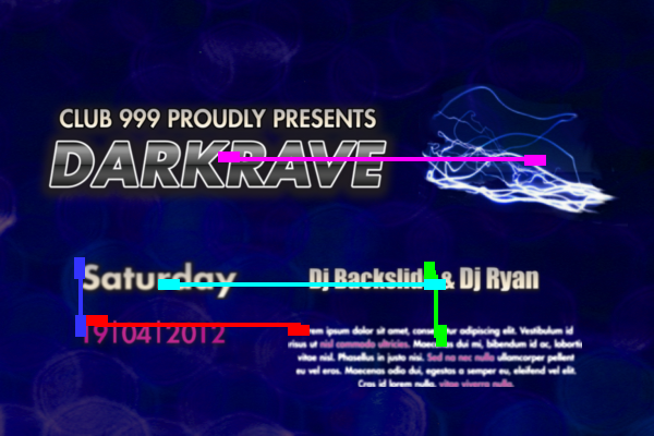
Credit: www.dgp.toronto.edu
Basic Alignment Principles
Understanding alignment in graphic layouts is crucial. It enhances readability and aesthetics. Basic alignment principles guide designers in creating visually appealing compositions. These principles ensure consistency and harmony in designs.
Horizontal Alignment
Horizontal alignment organizes elements across a horizontal line. It makes content easier to scan. Aligning text and images horizontally creates balance. This alignment is useful for headers and menus. It draws the reader’s eye across the page. Consistent horizontal alignment improves user experience.
Vertical Alignment
Vertical alignment arranges elements along a vertical axis. It ensures proper spacing and symmetry. Aligning elements vertically is vital for text blocks. This alignment helps maintain flow and structure. It provides a clear visual hierarchy. Vertical alignment is essential for long text sections.
Center Alignment
Center alignment places elements in the middle of a design. It creates a focal point. Centering text or images draws attention. This alignment suits single elements or small groups. It adds emphasis and focus. Center alignment is ideal for titles or calls to action.
Types Of Alignment
Understanding the types of alignment in graphic layouts is crucial for creating visually appealing designs. Alignment guides the placement of elements, ensuring consistency and harmony. It serves as the backbone of your design structure, making content more readable and aesthetically pleasing.
Imagine working on a project where everything just clicks. That’s the magic of perfect alignment. It transforms clutter into clarity and chaos into order. Let’s dive into three essential types of alignment that can elevate your graphic layouts.
Edge Alignment
Edge alignment is the simplest form, where elements are aligned along a common edge. Picture a row of images lined up perfectly on the left side. This type of alignment offers a clean and organized look. It’s ideal for creating strong lines that guide the viewer’s eye.
Think about the last time you arranged books on a shelf, ensuring their spines were flush with the edge. This technique works similarly, offering a sense of order and precision. Edge alignment is straightforward but powerful.
Challenge yourself: next time you design, try aligning elements to the edge and notice the difference in the overall composition. Does it feel more balanced?
Grid-based Alignment
Grid-based alignment uses a system of lines to arrange elements. It’s like creating a blueprint for your layout. This method helps maintain consistency across pages, especially in web design. You can think of it as constructing a city, where buildings align to a grid for uniformity.
Consider how grids help architects plan cities. Similarly, grids in design provide structure and flexibility. They allow for creativity within a framework, ensuring that each element finds its perfect place.
Experiment with grids. Have you ever tried using them in your designs? They could be the secret to achieving cohesion and balance.
Optical Alignment
Optical alignment considers visual perception rather than mathematical precision. It’s the art of aligning elements by how they appear to the eye. This type of alignment helps balance irregular shapes and sizes, making them look aligned even if they technically aren’t.
Consider how you might place a larger image slightly off-center to balance a smaller text block. Optical alignment is intuitive, allowing for adjustments that feel right rather than look right on a ruler. It’s the difference between a technically perfect layout and one that feels harmonious.
Try experimenting with optical alignment in your next design. How does your perception change when you trust your eyes over strict measurements?
Each type of alignment offers unique benefits. By understanding and applying them, you can enhance your graphic layouts, making them more effective and visually striking. Which type of alignment do you think will transform your designs the most?

Credit: blog.thenounproject.com
Tools For Alignment
Aligning elements in graphic layouts is crucial for visual harmony. Proper alignment ensures a clean and professional look. It guides the viewer’s eye naturally. Various tools help achieve perfect alignment, catering to different needs and preferences.
Software Options
Many graphic design software offer alignment features. Adobe Illustrator and Photoshop are popular choices. They provide grid and guide options for precise alignment. Another option is Canva, known for its user-friendly interface. It offers snap-to-grid features for easy alignment.
Inkscape is an open-source alternative. It provides similar alignment tools. These tools help align objects quickly and accurately. Choosing the right software depends on your needs and skills.
Manual Techniques
Sometimes, manual alignment can be more effective. Using a ruler or grid paper helps in traditional methods. These tools allow hands-on control over your layout. Visual judgment is key in manual techniques.
Another method involves using your mouse. Drag elements into place by eye. This technique requires practice. It develops a keen sense for visual balance. Manual alignment offers flexibility and creativity. It encourages a personal touch in design.
Common Alignment Mistakes
Understanding alignment in graphic layouts is crucial for creating visually appealing designs. Yet, common alignment mistakes often lead to cluttered and confusing visuals. These errors can detract from the message you want to convey and leave your audience bewildered. Let’s delve into two frequent pitfalls: misaligned elements and ignoring grid systems. These insights will help you refine your layout skills and improve your design outcomes.
Misaligned Elements
Misalignment happens when elements don’t line up properly, creating a jarring effect. Imagine looking at a poster where text boxes are uneven and images slightly off-center. This can make your design feel unprofessional.
One common mistake is not double-checking alignment after resizing elements. It’s easy to overlook, but even a small shift can disrupt the harmony of your design. Use alignment tools in your design software to ensure everything lines up perfectly.
Think about how you felt when you tried to hang a picture frame and it wasn’t quite straight. Frustrating, right? Your audience feels the same when faced with misaligned designs. Keep their eyes focused by aligning elements correctly.
Ignoring Grid Systems
Grid systems provide a structural foundation for your layout, ensuring consistency and order. Neglecting grids can lead to chaotic designs where elements seem randomly placed.
Consider a magazine layout where text and images lack a coherent structure. Without a grid, each page feels disjointed, making it hard for readers to follow. Grids help maintain a visual hierarchy and guide the viewer’s eye.
Do you remember playing with building blocks as a child? The blocks stacked neatly formed a stable structure. Similarly, using grids can create a cohesive design, balancing all elements harmoniously.
Ask yourself: Are you using grids effectively? If not, start integrating them into your design process. It can dramatically enhance the clarity and impact of your layouts.
Tips For Perfect Alignment
Achieving perfect alignment in graphic layouts enhances visual appeal and clarity. It draws attention to the right areas and improves the user experience. This section offers practical tips to achieve alignment perfection. Simple methods make a big difference in design. Read on to explore these effective strategies.
Use Alignment Guides
Alignment guides are essential tools for designers. They help maintain order and symmetry. Most design software includes these guides. Use them to place elements precisely. This prevents misalignment and clutter. It also ensures a neat and professional look. Guides can be vertical or horizontal. Use them to align text, images, and shapes. Consistent use of guides enhances layout harmony.
Consistent Spacing
Spacing affects how elements relate to each other. Consistent spacing creates balance. It makes the layout easy to navigate. Uneven spacing confuses the audience. It disrupts the flow and detracts from the message. To achieve consistency, use a grid system. It helps maintain uniform spacing throughout. Set standard margins and padding for elements. This approach ensures a cohesive and polished design.
Case Studies In Effective Alignment
Effective alignment transforms graphic layouts into harmonious designs. It guides the viewer’s eye and enhances readability. Case studies reveal practical insights into successful alignment strategies. By understanding real-world applications, designers can improve their work.
Successful Graphic Designs
Many successful graphic designs use alignment to create balance. Consider a magazine layout. Proper alignment makes text and images look organized. It helps the reader focus on important content. Another example is a website homepage. Alignment keeps navigation clear and user-friendly. These designs demonstrate alignment’s power in enhancing visual appeal.
Analyzing Real-world Examples
Real-world examples show alignment in action. Look at a popular brand’s advertisement. Its elements are aligned to highlight the message. This creates a strong visual impact. Examine a corporate brochure. It uses alignment to separate sections. This makes information easier to access. Such examples illustrate alignment’s role in effective communication.
Future Of Alignment In Graphic Design
The future of alignment in graphic design holds exciting possibilities. As design evolves, alignment becomes more than just arranging elements. It shapes how audiences perceive and interact with designs. Future trends in alignment will be influenced by technology and emerging design philosophies. Understanding these changes can enhance design skills and ensure relevance in the industry.
Technological Innovations
Technology plays a major role in graphic design evolution. New software offers precise alignment features. Designers can use tools to align elements with ease. AI-powered platforms suggest optimal alignment based on data. These innovations save time and improve design quality. Virtual reality introduces 3D alignment possibilities. Designers can create immersive experiences for users. The future promises more intuitive alignment tools.
Emerging Trends
Minimalism remains popular in graphic design. Designers use alignment to create clean, organized layouts. White space enhances focus on key elements. Asymmetrical alignment becomes a favorite choice for creatives. It adds dynamic energy to designs, drawing attention to unique features. Responsive design aligns elements across devices. It ensures consistent user experience regardless of screen size. These trends influence alignment strategies in modern design.
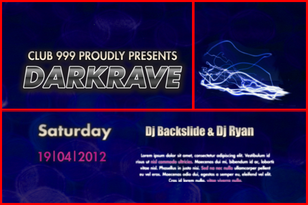
Credit: www.dgp.toronto.edu
Frequently Asked Questions
What Is Alignment In Graphics And Layout?
Alignment in graphics and layout refers to the arrangement of design elements. It ensures elements are visually connected, creating a cohesive look. Proper alignment enhances readability, balance, and aesthetics, guiding the viewer’s eye naturally. It involves positioning text, images, and other elements in relation to each other or the layout grid.
What Are The 7 Basic Principles Of Graphics And Layout?
The 7 basic principles of graphics and layout are balance, contrast, emphasis, rhythm, unity, alignment, and white space. These principles guide effective design, ensuring visual appeal, readability, and coherence. Applying them creates engaging and professional layouts that enhance communication and user experience.
What Are The 4 Types Of Alignment?
There are four types of alignment: left, right, center, and justified. Left aligns text to the left margin. Right aligns it to the right margin. Center alignment places text in the middle. Justified alignment evenly distributes text across both margins.
How To Improve Alignment In Design?
Use grids for structure. Align elements consistently. Utilize visual hierarchy. Ensure balance in design. Check for symmetry regularly.
Conclusion
Mastering alignment enhances graphic design skills significantly. It boosts visual appeal and readability. Every element should be thoughtfully positioned. This ensures balance and harmony in your layout. Consistent alignment creates a polished and professional look. Practice regularly to improve your design instincts.
Experiment with different alignments and observe the effects. Use guides and grids to maintain accuracy. Remember, even small adjustments can make a big difference. Keep refining your techniques for better results. A well-aligned graphic layout speaks volumes. It communicates your message clearly and effectively.
So, focus on alignment to elevate your graphic design projects.