Have you ever wondered why certain designs just feel right, or why some graphics seem to effortlessly catch your eye? The secret could lie in a centuries-old principle known as the Golden Ratio.
This mathematical formula has been a guiding star for artists, architects, and designers for ages, helping to create harmonious and aesthetically pleasing compositions. But what exactly is the Golden Ratio, and how can you apply its rules to elevate your graphic designs?
We’ll unlock the mysteries of the Golden Ratio, showing you how it can transform your work from ordinary to extraordinary. By the end, you’ll not only understand why it’s revered but also how to implement it in your own projects to captivate and engage your audience like never before. Curious to discover the magic behind this timeless design secret? Let’s dive in!
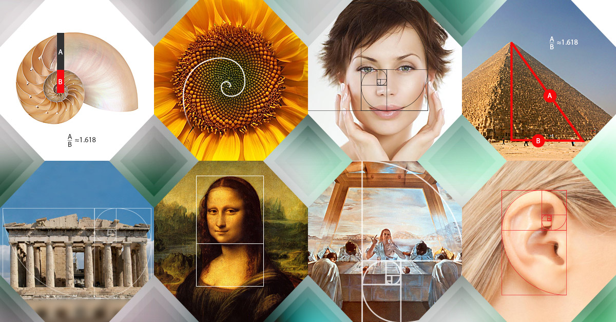
Credit: www.companyfolders.com
Golden Ratio Basics
Understanding the Golden Ratio can transform the way you create graphics. This ancient mathematical concept isn’t just for mathematicians. It holds secrets that can make your designs more appealing. Imagine being able to craft visuals that naturally draw the eye and hold attention. Let’s dive into the basics of the Golden Ratio.
Definition And History
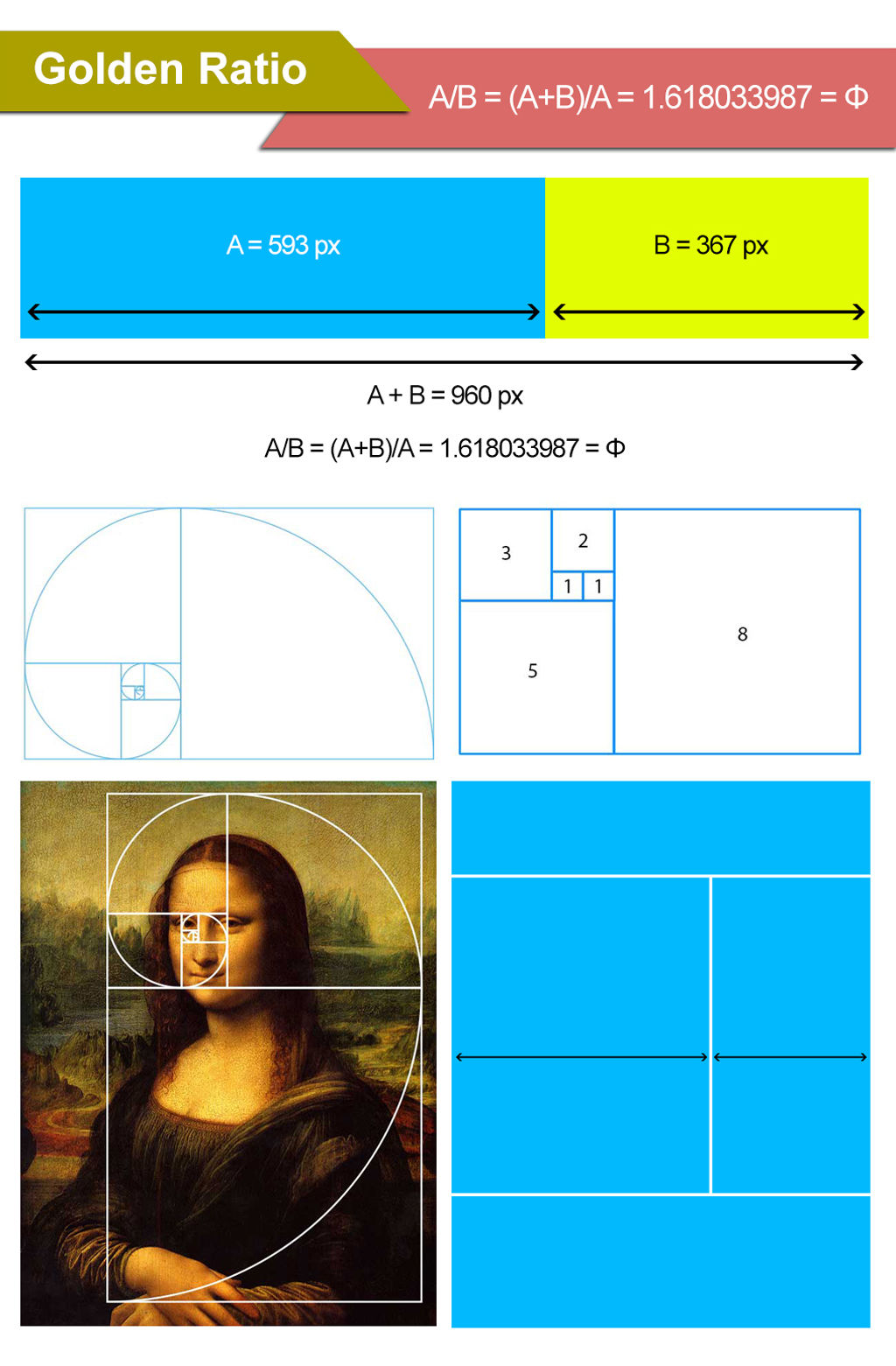
The Golden Ratio, often represented by the Greek letter Phi (Φ), is approximately 1.61803398875. It’s a number that appears when you divide a line into two parts. The longer part divided by the smaller part equals the whole length divided by the longer part. This ratio has fascinated artists and architects for centuries.
Did you know that the Golden Ratio is found in the pyramids of Egypt? Renaissance artists like Leonardo da Vinci used it in their works. It’s even present in nature, like the spirals of shells and the arrangement of leaves. These historical ties show its timeless influence on design.
Mathematical Formula
The formula for the Golden Ratio is simple. If a and b are two numbers where a > b, then:
| Formula | Explanation |
|---|---|
| a/b = (a+b)/a = Φ | Divide a by b, and this should equal the sum of a and b divided by a. |
Understanding this can be a game-changer. When you apply this ratio to your graphics, it creates balance and harmony. It’s like having a secret blueprint for visual appeal.
Start by experimenting with layouts. Use the ratio to determine the size of images or text blocks. You’ll notice a difference in how viewers perceive your work.
Do you think your design needs a refresh? Consider integrating the Golden Ratio. It could be the missing piece to elevate your graphics.

Credit: mightyfinedesign.co
Visual Harmony In Design
The concept of ‘Visual Harmony in Design’ is like a secret sauce that elevates a simple graphic into something extraordinary. It’s about making your designs appealing and balanced. When you achieve visual harmony, your audience will not only notice but also remember your work. You might have felt this when looking at a piece of art or an advertisement that just “felt right”. What’s behind this magic? The Golden Ratio.
Balance And Proportion
Balance and proportion are key ingredients in the recipe for visual harmony. The Golden Ratio provides a mathematical guideline to achieve this. Imagine a design where elements are scattered randomly. It feels chaotic, right? Now picture those elements arranged in a way that feels natural and pleasing. That’s balance. When proportions are guided by the Golden Ratio, your designs maintain that balance effortlessly.
Think of a photograph where the subject is framed perfectly, not too far left or right. It’s the Golden Ratio at work, ensuring that each element has its rightful place. This isn’t just about numbers; it’s about creating an experience that feels right. It’s like finding the perfect frame for a picture—it just makes everything look better.
Psychological Impact
The Golden Ratio doesn’t just help in arranging elements; it impacts the viewer on a deeper level. Designs that use this ratio tend to evoke positive feelings. Have you ever wondered why some logos stick in your mind? It’s because they tap into this psychological harmony.
Let’s say you’re designing a website. You want visitors to feel comfortable and engaged. Using the Golden Ratio can make your layout feel intuitive and welcoming. It’s not magic; it’s psychology. You might be surprised how much a well-proportioned design can influence behavior and perception.
Consider asking yourself: How can I make my designs more memorable? By leveraging the Golden Ratio, you can enhance not only the aesthetics but also the emotional impact of your work. It’s about connecting with your audience on a level that goes beyond the surface.
Applying The Golden Ratio
The Golden Ratio offers a fascinating way to enhance graphic design. This timeless principle is known for creating visually appealing compositions. Applying the Golden Ratio can bring harmony and balance to your design projects. Let’s explore how to integrate this concept effectively.
Grid Systems
Grid systems play a crucial role in design, providing structure and alignment. By using the Golden Ratio, grids can achieve perfect proportion. Designers can create layouts that guide the viewer’s eye smoothly. This approach ensures the content is organized and visually attractive. The Golden Ratio helps maintain consistency across different sections. It simplifies complex designs into manageable parts.
Typography And Layouts
Typography is more than just choosing a font. It’s about creating harmony between text elements. The Golden Ratio assists in selecting font sizes and spacing. This balance enhances readability and aesthetics. Layouts benefit from these principles, making content engaging. The ratio helps in designing headers, body text, and margins. It gives a structured look without seeming rigid. Consistent typography and layouts establish trust with viewers.
Golden Ratio In Color Theory
Explore the magic of the Golden Ratio in color theory for stunning graphics. Designers use this rule to create balance and harmony by selecting colors that appeal naturally to the human eye. This approach enhances visual appeal and creates engaging designs.
The Golden Ratio, a mathematical concept often represented by the Greek letter phi (φ), isn’t just for artists and architects. It plays a significant role in color theory, too. By applying the Golden Ratio, you can create visually appealing and harmonious color schemes that captivate and engage your audience. ###Color Balance
Color balance is crucial in achieving a visually pleasing design. You might have noticed how some designs just feel “right.” That’s often because of a balanced color scheme. The Golden Ratio can guide you in choosing the proportion of colors. For instance, if you’re working with three colors, you could use the ratio 1:0.618:0.382 to decide how much of each color to use. This method ensures that no single color dominates, maintaining harmony in your design. ###Contrast And Composition
Contrast is key when you want to highlight certain elements in your design. The Golden Ratio can help you find the perfect balance between contrasting colors. Consider two contrasting colors where one occupies the majority of the space while the other is used sparingly. Using the Golden Ratio for this distribution can make the contrast more appealing and less jarring. Have you ever noticed how some compositions just draw your eye naturally? That’s often because the designer used the Golden Ratio to place elements and colors in the design. This subtle use of contrast and composition can make your graphics more engaging and easier to understand. In your next project, try using the Golden Ratio to balance and contrast your colors. You might be surprised at how a simple mathematical principle can enhance your design’s effectiveness. Do you think your audience will notice the difference? Give it a try and see for yourself!Real-world Examples
Graphic designers often use the golden ratio to create balanced layouts. It appears in famous logos like Apple and Pepsi. This mathematical principle helps ensure harmony and visual appeal in design elements.
When you think of harmony in design, the golden ratio often comes into play. This timeless principle isn’t just a mathematical curiosity; it’s a tool that many designers use to create visually appealing graphics. Real-world examples can help you see how this ratio transforms ordinary designs into extraordinary ones.Famous Graphic Designs
The golden ratio has left its mark on some of the most famous graphic designs. Take the iconic poster of “The Beatles’ Abbey Road” album. The cover’s layout is not random; it reflects the golden ratio, creating a balanced and engaging composition. Similarly, the “Mona Lisa” is another masterpiece where the golden ratio plays a crucial role, guiding the viewer’s eye naturally across the artwork. Consider your favorite movie posters—chances are, the most memorable ones use the golden ratio to draw you in. Have you ever noticed how these designs seem effortlessly perfect? That’s the magic of the golden ratio at work.Branding And Logos
In branding and logos, the golden ratio is a secret weapon. Look at the Pepsi logo, redesigned in 2008, which subtly uses the golden ratio to create an appealing and harmonious look. This thoughtful design isn’t just about aesthetics; it makes the brand feel more trustworthy and professional. Apple’s logo, while simple, is another example. The placement of the bite in the apple follows the golden ratio, making it instantly recognizable and pleasing to the eye. These logos aren’t just about looking good—they’re about making you feel something. Next time you see a brand logo, ask yourself: does it feel balanced and inviting? The golden ratio might be the reason why. By using this principle, you can elevate your own designs, ensuring they are not just seen, but remembered.Tools And Techniques
Applying the golden ratio in graphics enhances visual appeal and balance. Designers use this mathematical principle to create harmonious layouts. Its use in tools and techniques helps achieve aesthetically pleasing compositions in design projects.
In the world of graphic design, mastering the golden ratio can elevate your work from ordinary to extraordinary. But how do you apply this mathematical marvel? You need the right tools and techniques. Whether you’re a seasoned designer or a curious newcomer, understanding these can dramatically improve your designs. Let’s dive into some practical methods to use the golden ratio effectively.Software Applications
Today, various software applications make using the golden ratio easier than ever. Adobe Illustrator, for instance, offers built-in grid and guide features that help you align elements in your design according to the golden ratio. Another handy tool is Sketch, which allows you to customize artboards and apply golden ratio templates with precision. Many designers also swear by tools like Golden Ratio Calculator, which integrates seamlessly with popular design software to provide real-time adjustments. Have you ever wondered how your favorite logos achieve such harmony? Chances are, the golden ratio played a role, made easier by these software aids. If you haven’t tried them yet, why not explore these options?Manual Calculations
While software applications simplify the process, manual calculations offer a deeper understanding. You can start by using the basic formula of the golden ratio, approximately 1.618. Divide your canvas or elements by this number to ensure their proportions align beautifully. A simple way to practice is by using a ruler and calculator. Determine the size of one element, then calculate its counterpart using the ratio. This hands-on approach sharpens your eye for balance. Manual calculations might seem daunting, but they offer an unmatched sense of achievement. Imagine the satisfaction of crafting a design purely from your own calculations. Have you ever tried manual calculations in your designs? The process can be surprisingly rewarding. Incorporate these tools and techniques into your workflow to harness the power of the golden ratio. Don’t just admire its beauty; make it a staple in your design toolkit.Challenges And Limitations
The golden ratio is a powerful tool in graphic design. It promises harmony and balance. But it is not always easy to use. Designers face challenges when applying it. Understanding these challenges helps in better utilization.
Misuse And Misunderstanding
Many designers misunderstand the golden ratio. They apply it incorrectly. Not every design benefits from it. Some use it just to follow trends. This can lead to poor results. Proper knowledge is essential. Without it, the golden ratio loses its magic.
Cultural Variations
The golden ratio is not universal. Different cultures view aesthetics differently. What looks good in one culture may not in another. Designers must consider cultural differences. This affects how the golden ratio is perceived. Tailoring design to fit cultural aesthetics is crucial.
Credit: www.interaction-design.org
Frequently Asked Questions
What Are The Rules For The Golden Ratio?
The golden ratio is approximately 1. 618. It involves dividing a line or shape into two parts. The longer part divided by the smaller part should equal the whole divided by the longer part. It is used in art, architecture, and nature to create visually pleasing compositions.
What Is The Golden Rule Of Graphic Design?
The golden rule of graphic design is to maintain balance and harmony in all elements. Prioritize visual hierarchy and ensure clear communication. Use consistent colors, typography, and spacing to create a cohesive design. Focus on user experience and make sure the design is visually appealing and functional.
What Is The Picture Golden Ratio Rule?
The golden ratio rule is a design principle used to create visually appealing compositions. It suggests dividing elements in a 1:1. 618 ratio, creating balance and harmony in pictures. This ratio is believed to be aesthetically pleasing and is often used in art, photography, and architecture.
What Is The Graphical Representation Of The Golden Ratio?
The graphical representation of the golden ratio is the golden spiral. This spiral grows outward by a factor of the golden ratio, approximately 1. 618, for every quarter turn it makes. It appears in nature, art, and architecture, symbolizing balance and aesthetic appeal.
Conclusion
The Golden Ratio adds harmony to graphic designs. Its use brings balance and beauty. Designers often rely on it for pleasing visuals. Applying it can enhance a design’s appeal. Simple shapes and layouts benefit greatly. Viewers find these designs more engaging.
The ratio guides the eye naturally. This results in a better viewing experience. Experiment with it in your projects. See how it transforms your work. Understanding its rules makes a big difference. Use the Golden Ratio wisely. Your designs will stand out.
They will leave a lasting impression.